I'm fitting four models to a dataset and trying to plot three graphical analysis for each model in a unique figure using ggplot and grid.arrange using the following reproducible code:
# Generate dataset
data <- data.frame(
  IDADE = c(1,2,3,4,5,6,7,8,9,10,11,12,13,14,15,16,17,18,19,20),
  HDOM = c(0.7,1.4,1.9,2.6,3.6,4.9,6.3,8,9.4,10.6,11.5,12.4,13.4,14.3,15.1,16,16.7,17.4,18,18.3)
)
# Fit models
library(minpack.lm)
model_a <- nlsLM(HDOM ~ a*(1-exp(-b*IDADE))^c,
                          start=list(a=30,b=0.5,c=1), control = nls.control(maxiter = 1024),
                          data = data)
model_b <- nlsLM(HDOM ~ b0*exp(-b1*(1/(IDADE^b2))),
                        start = list(b0=40,b1=5,b2=0.5), control = nls.control(maxiter = 1024),
                        data = data)
model_c <- nlsLM(HDOM ~ b0*(1-exp(-b1*IDADE^b2)),
                   start = list(b0=24,b1=0.05, b2=1.5), control = nls.control(maxiter = 1024),
                   data = data)
model_d = nlsLM(HDOM ~ b0*(1+b1*IDADE^b2)^b3,
                      start=list(b0=25,b1=-0.2, b2=-0.1, b3=20), control = nls.control(maxiter = 1024),
                      data = data)
# Model names
modelnames <- c('Model A','Model B','Model C','Model D')
# List of models
models <- list()
models[modelnames] <- list(model_a,model_b,model_c,model_d)
#List of plots
plot_analysis <- list()
for(i in 1:length(modelos)){
  plot_analysis[[paste0(modelnames[i],' - Fit curve')]] <- ggplot()+
    geom_line(aes(x=seq(0,20,0.1),y=predict(models[[i]],data.frame(IDADE=seq(0,idmax,0.1)))))+
    scale_x_continuous(expand=c(0,0), limits = c(0,idmax), breaks = seq(0,20,2))+
    scale_y_continuous(expand=c(0,0),limits = c(0,ls))+
    geom_point(alpha=0.2,aes(x=data$IDADE,y=data$HDOM))+
    xlab('Idade (anos)')+ylab('Hdom (m)')+
    ggtitle(paste0(modelnames[i],' - Syx = ',round(summary(models[[i]])$sigma,2)))

  plot_analysis[[paste0(modelos_nomes[i],' - Residual scatter plot')]] <-
    ggplot()+
    geom_point(alpha=0.2,aes(x=data$HDOM,y=residuals(models[[i]])/mean(data$HDOM)*100))+
    scale_x_continuous(expand=c(0,0))+
    scale_y_continuous(expand=c(0,0),limits = c(-50,50))+
    geom_line(aes(x=c(0,20),y=c(0,0)))+
    xlab('Hdom estimada (m)')+ylab('Desvio (%)')+
    ggtitle('')

  plot_analysis[[paste0(modelos_nomes[i],' - Histogram of residuals')]] <-
    ggplot()+
    geom_histogram(aes(x=residuals(models[[i]])/mean(data$HDOM)*100,
                       y=..count../length(data$HDOM)*100),
                   bins = 9,colour='black')+
    xlab('Classe')+
    ylab('Frequência (%)')+
    ggtitle('')
}
# Plot all in one figure
library(gridExtra)
do.call('grid.arrange',c(plot_analysis, ncol = 3))
The resulting plot is:
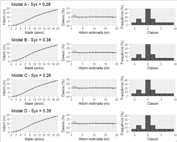
The issue: the four lines of images are showing the same results (Model D results). Only the titles correspond to the appropriate models. All other graphic results correspond to Model D.
Does anyone know how to solve this?
