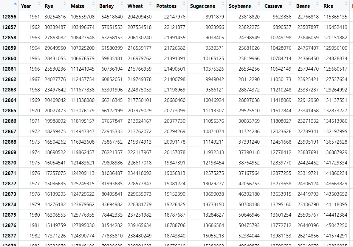
I have a data frame made. It contains different crops and their mean land area coverage for ascending years from 1961-2018 of different countries. I need to make a single rainbow line graph with contains different lines for each different crop (provided in columns) over the given time period. I am using the vegan package and know I need to use the loop function but I am struggling with how the code is supposed to be structured.
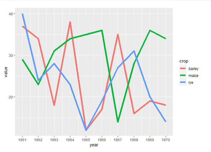
Hi @a_jacob9. Below is one way to achieve a line graph that first requires the data be transformed into a "long" format using the pivot_longer() function, and then uses ggplot() to create the graph.
library(tidyverse)
set.seed(123) # only needed to reproduce sample data

# sample data
mydata <- data.frame(
  year = c(1961:1970),
  rye = sample(10:40, size = 10, replace = T),
  maize = sample(10:40, size = 10, replace = T),
  barley = sample(10:40, size = 10, replace = T)
)

mydata
#>    year rye maize barley
#> 1  1961  40    29     37
#> 2  1962  24    23     34
#> 3  1963  28    31     18
#> 4  1964  23    34     38
#> 5  1965  12    35     12
#> 6  1966  19    36     17
#> 7  1967  27    14     35
#> 8  1968  31    28     16
#> 9  1969  20    36     19
#> 10 1970  14    34     18

# transform to "long" data (first 9 rows shown)
plot_data = mydata |>
  pivot_longer(-'year', names_to = 'crop')

head(plot_data, 9)
#> # A tibble: 9 × 3
#>    year crop   value
#>   <int> <chr>  <int>
#> 1  1961 rye       40
#> 2  1961 maize     29
#> 3  1961 barley    37
#> 4  1962 rye       24
#> 5  1962 maize     23
#> 6  1962 barley    34
#> 7  1963 rye       28
#> 8  1963 maize     31
#> 9  1963 barley    18

# create plot
ggplot(plot_data, aes(x = year, y = value)) +
  geom_line(aes(group = crop, color = crop), linewidth = 2) +
  scale_x_continuous(breaks = mydata$year)
Created on 2023-10-17 with reprex v2.0.2
This topic was automatically closed 42 days after the last reply. New replies are no longer allowed.
If you have a query related to it or one of the replies, start a new topic and refer back with a link.

