Creating a line graph for tracking learning progress

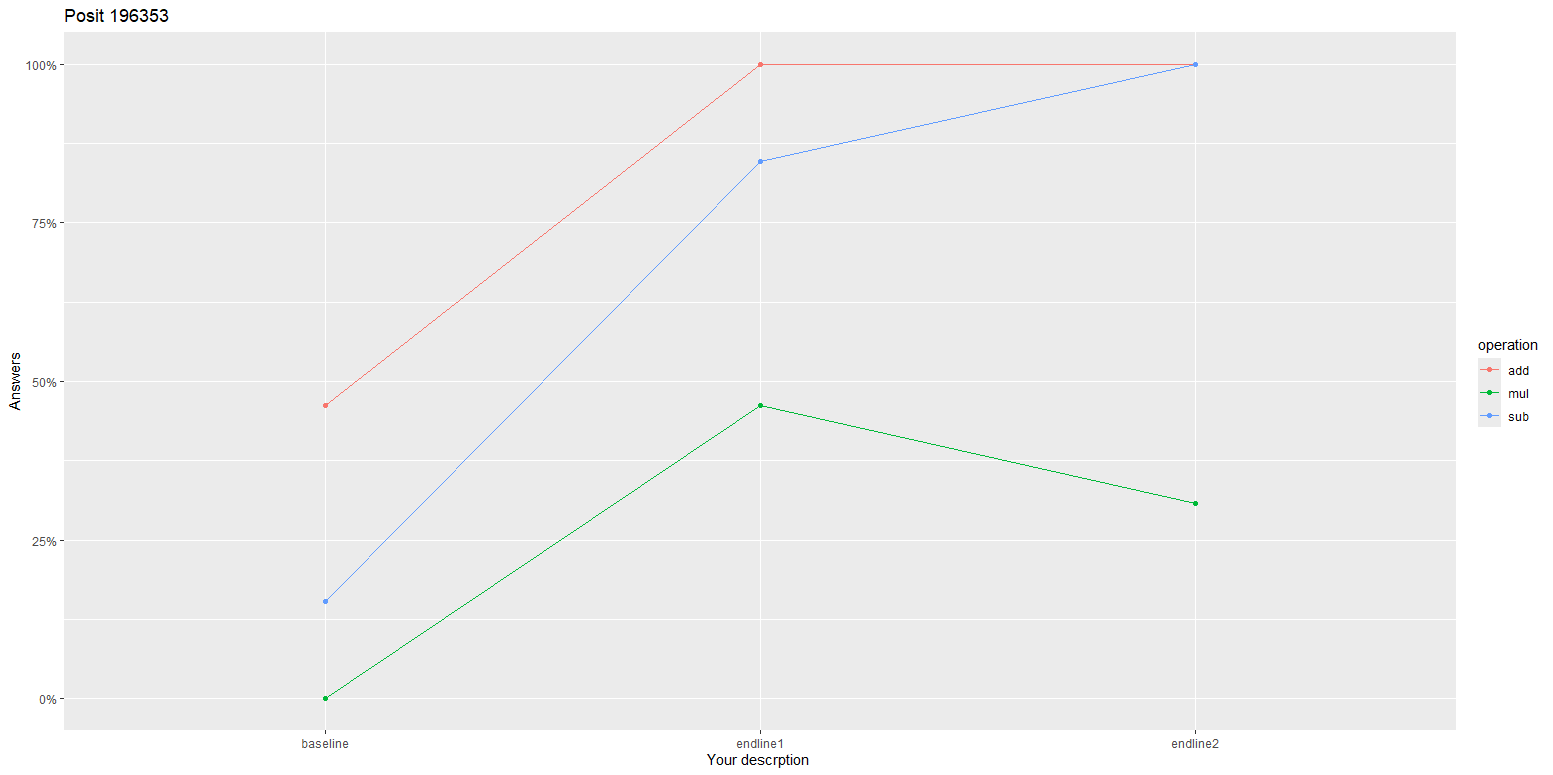
Hi I want to create a line graph which shows me the progress of learning outcomes of students from baseline to endline. In the given data frame "data", the student response for addition, subtraction and multiplication are given (1= answered, 2=not answered). The line graph should show the percentage of students who answered correctly from baseline to the endline in such a way that there are three lines representing addition, subtraction and multiplication. The x-axis shows baseline, first endline and second endline while the y-axis shows the % of students who answered correctly. Please help me how to create this visualisation.

library(tidyverse)
library(janitor)

data<-tibble::tribble(
    ~Student, ~baseline_add, ~baseline_sub, ~baseline_mul, ~endline1_add, ~endline1_sub, ~endline1_mul, ~endline2_add, ~endline2_sub, ~endline2_mul,
    "Nithin",         2L,         2L,         2L,         1L,         2L,         2L,         1L,         1L,         2L,
   "Pradeep",         2L,         2L,         2L,         1L,         1L,         1L,         1L,         1L,         2L,
   "Mrigank",         2L,         2L,         2L,         1L,         1L,         2L,         1L,         1L,         2L,
    "Barack",         2L,         2L,         2L,         1L,         1L,         2L,         1L,         1L,         2L,
     "Obama",         2L,         2L,         2L,         1L,         1L,         2L,         1L,         1L,         1L,
  "Gandhiji",         1L,         1L,         2L,         1L,         1L,         2L,         1L,         1L,         2L,
     "Nehru",         1L,         1L,         2L,         1L,         2L,         1L,         1L,         1L,         2L,
     "Patel",         1L,         2L,         2L,         1L,         1L,         1L,         1L,         1L,         2L,
      "Tara",         2L,         2L,         2L,         1L,         1L,         2L,         1L,         1L,         1L,
       "Sid",         1L,         2L,         2L,         1L,         1L,         2L,         1L,         1L,         1L,
       "Yen",         1L,         2L,         2L,         1L,         1L,         1L,         1L,         1L,         1L,
       "Rub",         1L,         2L,         2L,         1L,         1L,         1L,         1L,         1L,         2L,
       "Mep",         2L,         2L,         2L,         1L,         1L,         1L,         1L,         1L,         2L
  )
2 Likes

Hi @kuttan98

d <- data |> 
  pivot_longer(cols = !Student, names_to = "what", values_to = "value") |>
  separate(what, into = c("order", "operation"), sep = "_") |>
  mutate(
    order = factor(order, ordered = TRUE, levels = c("baseline", "endline1", "endline2")),
    value = ifelse(value == 1,1,0)) |>
  group_by(order, operation) |>
  summarise(percentage = sum(value)/n())


ggplot(d,
       aes(x=order, y=percentage, group=operation, colour = operation)) +
  geom_line() +
  geom_point() + 
  ggtitle(paste("Posit 196353")) +
  xlab("Your descrption ") +
  ylab("Answers") +
  scale_y_continuous(labels = scales::percent)

1 Like

Thanks a lot for the help.

This topic was automatically closed 7 days after the last reply. New replies are no longer allowed.

If you have a query related to it or one of the replies, start a new topic and refer back with a link.