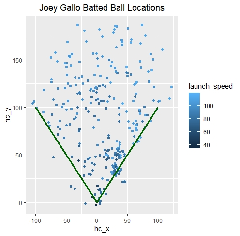
Hi, I was wondering if there is a way to put a heat map on the below picture. I would like to see what areas of the field he frequently hits the ball to. If it is possible, I would also like to add the percentage too. For example, 40% of his batted balls land in this location. Thank you.
mc_spray <- data.frame(
new_x = c(12.84, 25.12, 28.08, 15.95, 45.35, -56.49, 29.61, 45.35,
25.4, 8.82000000000001, 3.58999999999999, 4.30999999999999,
9.76000000000001, 48.79, 9.14999999999999, 32.17, 65.8,
9.44000000000001, 32.91, 29.88, 56.53, -67.44, -53.34, 34.48,
79.3, 37.51, 71.4, -76.92, 70.5, 36.77, -41.72, -43.54, 102.17,
-27.97, 62.93, 1.22, 64.69, -29.05, 28.11, 34.26),
new_y = c(55.19, 147.63, 30.81, 45.17, 50.62, 100.72, 31.83, 48.59,
46.36, 174.33, 2.15000000000001, 182.1, 123.35, 136.65,
25.23, 185.13, 63.6, 63.99, 36.54, 40.78, 171.6, 157.65, 68.16,
50.6, 91.79, 53.02, 68.5, 80.59, 148.59, 92.59, 98.52, 82.16,
106.77, 147.87, 111.51, 17.24, 114.56, 130.88, 32.75,
33.42),
launch_speed = c(84.6, 108.2, 91, 65.9, 92.3, 99.9, 69.3, 78.2, 110.9,
107.7, 82.9, 110.4, 91.3, 98.2, 103.5, 109.7, 107.3, 94.2,
102.5, 103.2, 109.5, 108.9, 89.2, 78.1, 109.8, 89.6, 110.5,
104.9, 109.5, 86.7, 99.4, 89.2, 113.3, 100.9, 80, 56.2, 109.5,
98.2, 91.8, 90.3)
)
x <- c(0,100)
y <- c(0,100)
line1 <- data.frame(x,y)
x1 <- c(0,-100)
x2 <- c(0,100)
line2 <-data.frame(x1,x2)
ggplot()+
geom_point(data = mc_spray, aes(x=new_x, y=new_y, color=launch_speed))+
geom_line(data=line1, aes(x=x,y=y), size=1.1, color="darkgreen")+
geom_line(data=line2, aes(x=x1,y=x2), size=1.1, color="darkgreen")+
xlab("hc_x") + ylab("hc_y") + ggtitle("Joey Gallo Batted Ball Locations")+
theme(plot.title = element_text(hjust = 0.5))