Create sales report in R ggplot2

I want to create sales report in R using ggplot2. I want dates in x-axis and $ sales in y-axis and I also want to show promotions we did during the whole sale period. So we can Identify which promotions did well. I was able to do it thru geom_point and use color=Promotions but some of my promotions are overlapping and don't know how to tackle that. What is the best way I can achieve this.

I am open to use any other graph like bar or histogram if that can help me achieve this scenario.

Here's the code I use.

ggplot(data = sales)+
 geom_point(mapping = aes(x = Date, y = Total_Sales, color = Promotions, size = Total_Sales))+ 
 theme(axis.text.x = element_text(angle = 90, vjust = 0.5, hjust=1))

Hello.
Thanks for providing code , but you could take further steps to make it more convenient for other forum users to help you.

Share some representative data that will enable your code to run and show the problematic behaviour.

You might use tools such as the library datapasta, or the base function dput() to share a portion of data in code form, i.e. that can be copied from forum and pasted to R session.

Reprex Guide

Sure here's the complete code and the csv file I am using

install.packages("tidyverse")
install.packages("janitor")
install.packages("skimr")
library(tidyverse)
library(skimr)
library(janitor)

sales <- read.csv("Sales By Day report/Sale-test1.csv", fileEncoding = 'UTF-8-BOM')

sales$Date <- strptime(as.character(sales$Date), "%m/%d/%y")

ggplot(data = sales)+
  geom_point(mapping = aes(x=Date, y=Total_Sales, color=Events,size=Total_Sales))+ 
  theme(axis.text.x = element_text(angle = 90, vjust = 0.5, hjust=1))

Sales.csv

Between 11/2/2021 & 11/7/2022. Candle Sale & Holiday Sale were active. So they are overlapping. How can I plot these event in the graph?

add alpha=.5 to the geom_point so that overlapping points can show up through each other ?
change geom_point to geom_jitter, to arbitrarily move the points a little bit left/right at random to spread them?

Hi Nabeegh. I think one way to go about this would be to use a stacked bar chart to show the overlap. The problem with stacked charts is that it can be hard to see changes in the categories not at the bottom, but with so few categories, I think it could work here if the visual weight of the overall total sales is the most important aspect.


install.packages("tidyverse")
install.packages("scales")

library(tidyverse)
library(scales)

Date <- c(
    '10/27/2021', '10/28/2021', '10/29/2021', '10/30/2021', '10/31/2021', '10/31/2021', '11/1/2021', '11/2/2021', '11/3/2021', '11/4/2021', '11/5/2021', '11/6/2021', '11/6/2021', '11/7/2021'
    )

Total_Order <- c(
    289, 194, 216, 198, 165, 165, 120, 102, 114, 116, 114, 68, 68, 123
)

Total_Sales <- c(
    17190.668, 16882.324, 15238.71, 15453.082, 20830.2122, 20830.2122, 8414.412, 6987.064, 11078.11, 10797.09, 9042.466, 6844.768, 6844.768, 11623.452
)

Events <- c(
    'Outlet 40%off', 'Outlet 40%off', 'Outlet 40%off', 'Outlet 40%off', 'Outlet 40%off', 'Holiday Sale', 'Holiday Sale', 'Holiday Sale', 'Candle Sale', 'Candle Sale', 'Candle Sale', 'Candle Sale', 'Holiday Sale', 'Candle Sale'
)

df <- 
    data.frame(Date = as.Date(Date, format = "%m/%d/%y"), Total_Order, Total_Sales, Events)

df |> 
    ggplot(aes(x = Date, y = Total_Sales, fill = Events)) +
    geom_bar(stat = "identity") +
    geom_text(aes(label = scales::dollar(Total_Sales, largest_with_cents = 1)), size = 3, position = position_stack(vjust = 0.5)) +
    theme_minimal() +
    theme(panel.grid.major.x = element_blank(), panel.grid.minor = element_blank()) +
    scale_x_date(date_breaks = "3 days", date_labels = "%b %d") +
    scale_y_continuous(labels = scales::dollar) +
    labs(
        title = "Total Sales by Day",
        subtitle = "Broken out by events",
        y = "Total Sales"
    )

Thanks, @MJPeyton This is very helpful. However, If you see on 10/31 it is summing up the total sales twice. It should be 20830 only, but it is showing 40000.

Hi @Nabeegh10,

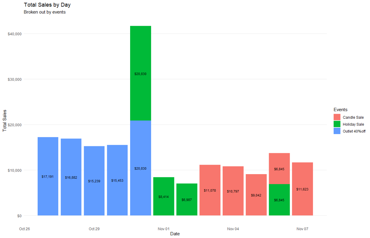
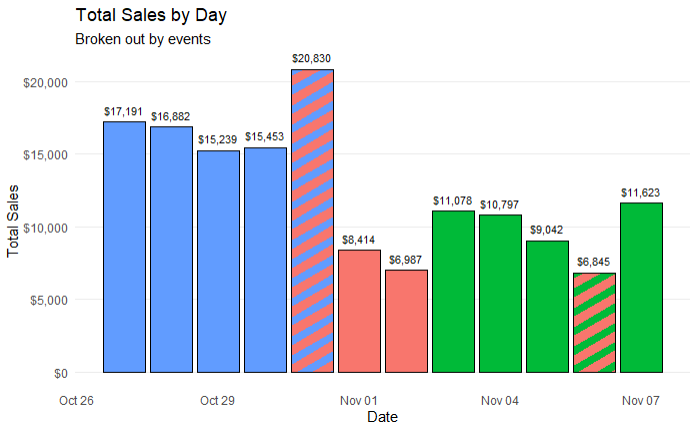
Sorry, I took each row in your CSV to be a data point. If you're not able to attribute sales to individual promotions, I might try something like this:


install.packages("tidyverse")
install.packages("scales")
install.packages("purrr")
install.packages("ggpattern")

library(tidyverse)
library(scales)
library(purrr)
library(ggpattern)

Date <- c(
    '10/27/2021', '10/28/2021', '10/29/2021', '10/30/2021', '10/31/2021', '10/31/2021', '11/1/2021', '11/2/2021', '11/3/2021', '11/4/2021', '11/5/2021', '11/6/2021', '11/6/2021', '11/7/2021'
    )

Total_Order <- c(
    289, 194, 216, 198, 165, 165, 120, 102, 114, 116, 114, 68, 68, 123
)

Total_Sales <- c(
    17190.668, 16882.324, 15238.71, 15453.082, 20830.2122, 20830.2122, 8414.412, 6987.064, 11078.11, 10797.09, 9042.466, 6844.768, 6844.768, 11623.452
)

Events <- c(
    'Outlet 40%off', 'Outlet 40%off', 'Outlet 40%off', 'Outlet 40%off', 'Outlet 40%off', 'Holiday Sale', 'Holiday Sale', 'Holiday Sale', 'Candle Sale', 'Candle Sale', 'Candle Sale', 'Candle Sale', 'Holiday Sale', 'Candle Sale'
)

df <- 
    data.frame(Date = as.Date(Date, format = "%m/%d/%y"), Total_Order, Total_Sales, Events) |> 
    mutate(color = case_when(
        Events == 'Outlet 40%off' ~ "red",
        Events == 'Holiday Sale' ~ "blue",
        Events == 'Candle Sale' ~ "green"
    )) |> 
    group_by(Date, Total_Order, Total_Sales) |> 
    summarize(Events = paste(Events, collapse=", "),
              colors = list(color)) |> 
    #ungroup() |> 
    mutate(pattern = case_when(
        lengths(colors) == 1 ~ "blank",
        lengths(colors) > 1 ~ "hdashes"
    )) |> 
    mutate(backgroundColor = pluck(colors, 1, 1)) |> 
    mutate(patternColor = pluck(colors, 1, 2, .default = backgroundColor)) 
    
df |> 
    ggplot(aes(x = Date, y = Total_Sales)) +
    geom_col_pattern( 
        aes(
            x = Date, 
            y = Total_Sales,
            pattern_colour = patternColor,
            pattern_fill = patternColor,
            fill = backgroundColor
        ),
            colour='black',
            pattern = "stripe",
            pattern_density = 0.5
        ) +
    geom_text(aes(label = scales::dollar(Total_Sales, largest_with_cents = 1)), size = 3, vjust = -0.8) +
    theme_minimal() +
    theme(
        panel.grid.major.x = element_blank(), 
        panel.grid.minor = element_blank(),
        legend.position = "none") +
    scale_x_date(date_breaks = "3 days", date_labels = "%b %d") +
    scale_y_continuous(labels = scales::dollar) +
    labs(
        title = "Total Sales by Day",
        subtitle = "Broken out by events",
        y = "Total Sales"
    ) 
    

I don't love the ggpattern package since the legends are a mess, but this technically works.

This topic was automatically closed 21 days after the last reply. New replies are no longer allowed.

If you have a query related to it or one of the replies, start a new topic and refer back with a link.