Create legend for plot with mulitple normal distributions

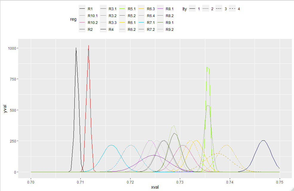
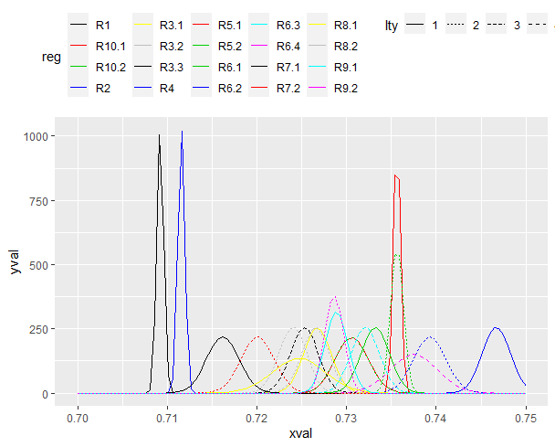
I have created a plot with mulitple normal distributions using the mapply and stat_fuction function in ggplot. I have assigned each line a unique color and line type (dashed or solid), but I have not figured out how to include a legend in the figure. This is my first time using the stat_function in ggplot and an completely lost on how this function talks with the aesthetic mapping funtion (aes) to create the legend. I need the legend to show both the color and line type (dashed or solid) for each normal distribution. The code below will produce the figure without the legend, but has my attempt at producing the legend.

Any assitance would be greatly appreciated. Thanks in advance.

library(ggplot2)

p1 <- ggplot(data = data.frame(x = c(0.707, 0.757)), aes(x = x)) +
  
  mapply(function(mean, sd, col, lty, reg) {
    stat_function(fun = dnorm, args = list(mean = mean, sd = sd), aes(colour = reg), col = col, lty = lty, lwd = 1.5)
  }, 
  # mean, sd, col, lty
  mean = c(0.7092, 0.711533333, 0.72675, 0.726566667, 0.7253, 0.7467, 0.7356, 0.7356, 0.7332, 0.7393, 0.7321, 0.737533333, 0.7162, 0.7201, 0.7247,
           0.724, 0.7289, 0.728657143, 0.7306, 0.7306),
  
  sd = c(0.000381708, 0.000381708, 0.001557951, 0.001557951, 0.001557951, 0.001557951, 0.000381708, 0.000696549, 0.001557951, 0.001827967,
         0.001557951, 0.002658488, 0.001827967, 0.001827967, 0.002968083, 0.001557951, 0.001266277, 0.001051011, 0.001842546, 0.001842546),
  
  reg = c("R1", "R2", "R3.1", "R3.2", "R3.3", "R4", "R5.1", "R5.2", "R6.1", "R6.2", "R6.3", "R6.4", 
            "R7.1", "R7.2", "R8.1", "R8.2", "R9.1", "R9.2", "R10.1", "R10.2"),
  
  col = c("black", "red", "gray38", "gray58", "gray78", "darkblue", "chartreuse", "chartreuse4", "gold", "gold3", "goldenrod1", "goldenrod3",
          "deepskyblue", "deepskyblue3", "darkorchid", "darkorchid1", "darkolivegreen", "darkolivegreen3", "hotpink", "hotpink3"),
  
  lty = c(1, 1, 1, 2, 3, 1, 1, 2, 1, 2, 3, 4, 1, 2, 1, 2, 1, 2, 1, 2))

p1 + scale_colour_manual(name = "Regions",
                        
                        values = c("black", "red", "gray38", "gray58", "gray78", "darkblue", "chartreuse", "chartreuse4", "gold", "gold3", "goldenrod1", "goldenrod3",
                                 "deepskyblue", "deepskyblue3", "darkorchid", "darkorchid1", "darkolivegreen", "darkolivegreen3", "hotpink", "hotpink3"), 
                        
                        breaks = c("R1", "R2", "R3.1", "R3.2", "R3.3", "R4", "R5.1", "R5.2", "R6.1", "R6.2", "R6.3", "R6.4", 
                                   "R7.1", "R7.2", "R8.1", "R8.2", "R9.1", "R9.2", "R10.1", "R10.2"),
                        
                         labels = c("1", "2", "3.1", "3.2", "3.3", "4", "5.1", "5.2", "6.1", "6.2", "6.3", "6.4", 
                                 "7.1", "7.2", "8.1", "8.2", "9.1", "9.2", "10.1", "10.2"))

p1 + scale_linetype_manual(values = c(1, 1, 1, 2, 3, 1, 1, 2, 1, 2, 3, 4, 1, 2, 1, 2, 1, 2, 1, 2)) 
  
p1 + theme(legend.position="top")

p1

It may be a matter of style, but I prefer to calculate my own data first, and then pass complete (as much as possible) data to ggplot and calculate the minimum possible on the fly with stat_functions as possible.
I find it helps with readability of the code, helps to debug etc, and gives me the most control.

library(tidyverse)
data_parms <- data.frame( # mean, sd, col, lty
  mean = c(
    0.7092, 0.711533333, 0.72675, 0.726566667, 0.7253, 0.7467, 0.7356, 0.7356, 0.7332, 0.7393, 0.7321, 0.737533333, 0.7162, 0.7201, 0.7247,
    0.724, 0.7289, 0.728657143, 0.7306, 0.7306
  ),
  sd = c(
    0.000381708, 0.000381708, 0.001557951, 0.001557951, 0.001557951, 0.001557951, 0.000381708, 0.000696549, 0.001557951, 0.001827967,
    0.001557951, 0.002658488, 0.001827967, 0.001827967, 0.002968083, 0.001557951, 0.001266277, 0.001051011, 0.001842546, 0.001842546
  ),
  reg = c(
    "R1", "R2", "R3.1", "R3.2", "R3.3", "R4", "R5.1", "R5.2", "R6.1", "R6.2", "R6.3", "R6.4",
    "R7.1", "R7.2", "R8.1", "R8.2", "R9.1", "R9.2", "R10.1", "R10.2"
  ),

  col = c(
    "black", "red", "gray38", "gray58", "gray78", "darkblue", "chartreuse", "chartreuse4", "gold", "gold3", "goldenrod1", "goldenrod3",
    "deepskyblue", "deepskyblue3", "darkorchid", "darkorchid1", "darkolivegreen", "darkolivegreen3", "hotpink", "hotpink3"
  ),

  lty = factor(c(1, 1, 1, 2, 3, 1, 1, 2, 1, 2, 3, 4, 1, 2, 1, 2, 1, 2, 1, 2))
)

data_calced <- map(1:nrow(data_parms),
                   ~ dnorm(seq(from=.7,to=.75,length.out = 100),
                           mean = data_parms[.,"mean"],
                           sd =  data_parms[.,"sd"]))


colvec <- data_parms$col
names(colvec) <- data_parms$reg

df1<-as_tibble(dplyr::mutate(data_parms, xval = rep(list(seq(from=.7,to=.75,length.out = 100)),20),
                             yval=data_calced)) %>% unnest(cols=c(xval,yval))

p1 <- ggplot(df1,aes(x=xval,y=yval,color=reg,lty=lty)) +
  geom_line() +
  scale_color_manual(values=colvec)+
  xlim(c(.7,.75)) + theme(legend.position="top")

p1

I like your style....doing the calcuations up front is a much better approach. However, I get a different result when I copy and paste your code into Rstudio. The line types are the same, but the lines colors are different. Note the difference in the line colors assiged to each "reg" group.

Rplot01

I figured out a way around this issue (see below), but it is certainly not as elegant as your solution. Any idea why we have different results? Thanks again.

  geom_line(aes(lty = lty, color = reg)) +
  xlim(c(0.7, 0.75)) +
  scale_color_manual(values = c(
    "R1" = "black",
    "R2" = "red",
    "R3.1" = "gray38",
    "R3.2" = "gray58",
    "R3.3" = "gray78",
    "R4" = "darkblue",
    "R5.1" = "chartreuse",
    "R5.2" = "chartreuse4",
    "R6.1" = "gold",
    "R6.2" = "gold3",
    "R6.3" = "goldenrod1",
    "R6.4" = "goldenrod3",
    "R7.1" = "deepskyblue",
    "R7.2" = "deepskyblue3",
    "R8.1" = "darkorchid",
    "R8.2" = "darkorchid1",
    "R9.1" = "darkolivegreen",
    "R9.2" = "darkolivegreen3",
    "R10.1" = "hotpink",
    "R10.2" = "hotpink3")) +
  theme(legend.position="top")

p1

If you have copy and pasted my code without changes and recieved differerent results... I don't have an explanation for that. I don't even think that differing package versions are likely an explanation.
Is it possible that some part of the code you ran was altered ?
your manual named vector is identical to the one I created programatically (at least on my computer)
if you compare the str() of colvec that you adapted to me , with your manually created named vector wrapped in str() it should be the same

I have updated R, updated R studio, and updated all my packages and I still get the same issue when I copy and paste your code into R. Not sure what is going on.

Oh well....you got the code running and I made a few small changes...so we figured it out in the end.

Thanks again for help. Take care.

what happens when you assign it to a variable name and then use it by referencing that

vesuccio_cols <- c(
    "R1" = "black",
    "R2" = "red",
    "R3.1" = "gray38",
    "R3.2" = "gray58",
    "R3.3" = "gray78",
    "R4" = "darkblue",
    "R5.1" = "chartreuse",
    "R5.2" = "chartreuse4",
    "R6.1" = "gold",
    "R6.2" = "gold3",
    "R6.3" = "goldenrod1",
    "R6.4" = "goldenrod3",
    "R7.1" = "deepskyblue",
    "R7.2" = "deepskyblue3",
    "R8.1" = "darkorchid",
    "R8.2" = "darkorchid1",
    "R9.1" = "darkolivegreen",
    "R9.2" = "darkolivegreen3",
    "R10.1" = "hotpink",
    "R10.2" = "hotpink3")

#ggplot stuff ....
 + scale_color_manual(values = vesuccio_cols) + ....

This topic was automatically closed 21 days after the last reply. New replies are no longer allowed.