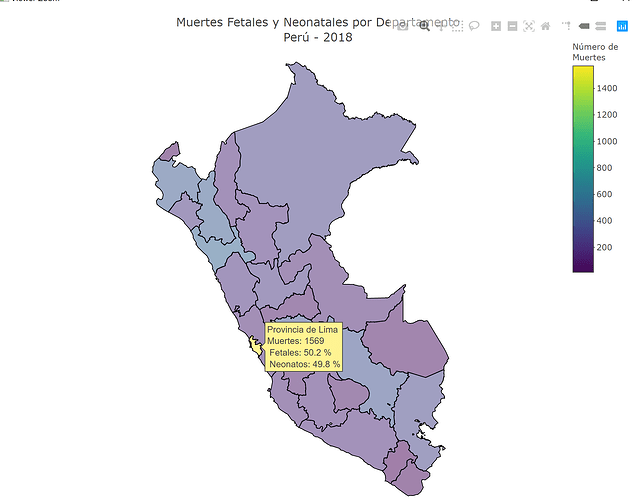
A Shape file (shp) is not the same as a Simple Features file (sf), you would have to convert it to a sf file first, like in this example.
library(tidyverse)
library(plotly)
library(sf)

mapa_peru <- read_sf("PERUFINAL.shp")
df <- read.csv("muertes.csv", stringsAsFactors = FALSE)
names <- c("Apur.+" = "Apurímac", "Huánuco" = "Huánuco", "Junin" = "Junín", "San Martin" = "San Martín")

map_data <- df %>%
    mutate(depart = str_replace_all(depart, names),
           hover = paste(depart, "<br>Muertes:",
                         muertes2018,
                         "<br> Fetales:", scales::number(pcfet2018, suffix = " %", accuracy = 0.1),
                         "<br> Neonatos:", scales::number(pcneo2018, suffix = " %", accuracy = 0.1)
                         )
           ) %>%
    full_join(mapa_peru, by = c("codigo" = "IDDPTO")) %>%
    st_sf()

plot_ly(map_data, color = I("gray90"), stroke = I("black"), span = I(1)) %>%
    add_sf(
        color = ~muertes2018,
        split = ~depart,
        span = I(1),
        text = ~hover,
        hoverinfo = "text",
        hoveron = "fills"
    ) %>%
    colorbar(title = "Número de<br>Muertes") %>%
    layout(
        title = 'Muertes Fetales y Neonatales por Departamento<br>Perú - 2018',
        showlegend = FALSE
    )
And, as a side comment, the extreme difference among Lima province and every other department is due to the difference in population density, I think you should consider using a transformation like number of deaths per 100 000 population
