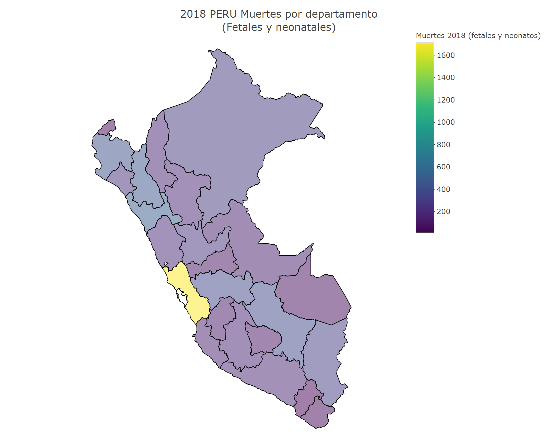
The last time I checked, plotly only provided state level polygons for the U.S., so if you want to make a choropleth for Perú you need to provide your own polygons, I can share with you a light department level sf file you can work with, see this example:
library(tidyverse)
library(plotly)

mapa_peru <- readRDS("peru_simp.rds")
df <- read.csv("muertes.csv")

names <- c("Apur.+" = "Apurímac", "Huánuco" = "Huánuco", "Junin" = "Junín", "San Martin" = "San Martín")

map_data <- df %>%
    mutate(depart = str_replace_all(depart, names),
           hover = paste(depart, '<br>', "Muertes", muertes2018, "Fetales %", pcfet2018, "<br>",
                         "Neonatos %", pcneo2018)) %>%
    full_join(mapa_peru, by = c("depart" = "NAME_1"))
map_data <- sf::st_sf(map_data)

plot_ly(map_data, color = I("gray90"), stroke = I("black"), span = I(1)) %>%
    add_sf(
        color = ~muertes2018,
        split = ~depart,
        span = I(1),
        text = ~hover,
        hoverinfo = "text",
        hoveron = "fills"
    ) %>%
    colorbar(title = "Muertes 2018 (fetales y neonatos)") %>%
    layout(
        title = '2018 PERU Muertes por departamento<br>(Fetales y neonatales)',
        showlegend = FALSE
    )