Hi everybody ,
I want to create a graphic that way with ggplot2.
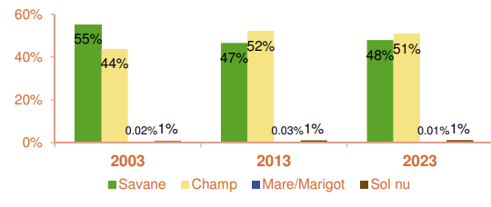
it's temporel serie data
Picture in PJ
Providing a reprex (see the FAQ) will make it more likely to attract answers. In this case, all that is needed is data, which can be done with the dput() function, applied to a data frame named after yours. I use d for illustration
dput(d)
Cut and paste the output appearing in the console window. It will have the following appearance
structure(list(model = c("Mazda RX4", "Mazda RX4 Wag", "Datsun 710",
"Hornet 4 Drive", "Hornet Sportabout", "Valiant"), cyl = c(2,
4, 6, 8, 10, 12), wt = c(1, 3, 5, 7, 9, 11)), class = "data.frame", row.names = c(NA,
6L))
This topic was automatically closed 42 days after the last reply. New replies are no longer allowed.
If you have a query related to it or one of the replies, start a new topic and refer back with a link.