Hello again. I am trying to create boxplots and barplots from different sets of data I have defined. Problem is, in all guides I have found on how to do it, only two variables are used, but in my data frames I have either 3 or 5. Here are a couple examples of said dataframes:
summary(ChloroCont)
Art. Mean_chloro_May Mean_chloro_June Mean_chloro_July Mean_chloro_August Mean_chloro_September
Length:18 Min. :11.68 Min. :19.22 Min. :24.54 Min. :24.44 Min. :23.47
Class :character 1st Qu.:17.86 1st Qu.:26.26 1st Qu.:28.74 1st Qu.:29.34 1st Qu.:29.18
Mode :character Median :19.50 Median :30.30 Median :33.56 Median :36.72 Median :32.70
Mean :21.19 Mean :29.46 Mean :33.16 Mean :34.42 Mean :34.10
3rd Qu.:25.46 3rd Qu.:33.04 3rd Qu.:37.56 3rd Qu.:38.64 3rd Qu.:37.64
Max. :31.56 Max. :36.47 Max. :42.73 Max. :42.88 Max. :46.97
NA's :3
summary(MeanDBH)
Art. Mean_DBH_May Mean_DBH_September
Length:18 Min. : 8.52 Min. : 8.76
Class :character 1st Qu.:10.09 1st Qu.:10.99
Mode :character Median :11.04 Median :11.83
Mean :12.12 Mean :12.76
3rd Qu.:13.91 3rd Qu.:14.14
Max. :21.64 Max. :20.13
I am quite frustrated because this is an incredibly easy task to perform in Excel, but I am required to do this in R by my supervisor. Is there any way to create boxplots/barplots with dataframes like this that doesn't involve modifying the original dataframes or creating new ones?
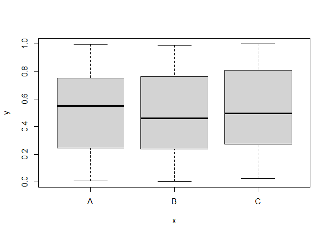
I'm not sure I fully understand what you mean, but if you like to plot multiple variables to different boxplots you can do that like this:
set.seed(4) #For reproducibility

### BASE R ###

#Generate random data
myData = data.frame(x = LETTERS[1:3], y = runif(300))
head(myData)
#>   x           y
#> 1 A 0.585800305
#> 2 B 0.008945796
#> 3 C 0.293739612
#> 4 A 0.277374958
#> 5 B 0.813574215
#> 6 C 0.260427771

#Boxplot
boxplot(y ~ x, data = myData)
Thank you for your quick answer. I am aware you can create boxplots and barplots like these, but I was wondering if there was any way to add an additional layer to it. I am working whit monthly measurements per species, so I wanted to creat a plot that could display all monthly measurement per species without having to create one plot per month.
PJ seems to have given you that ; what is missing ?
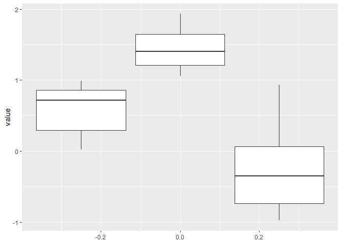
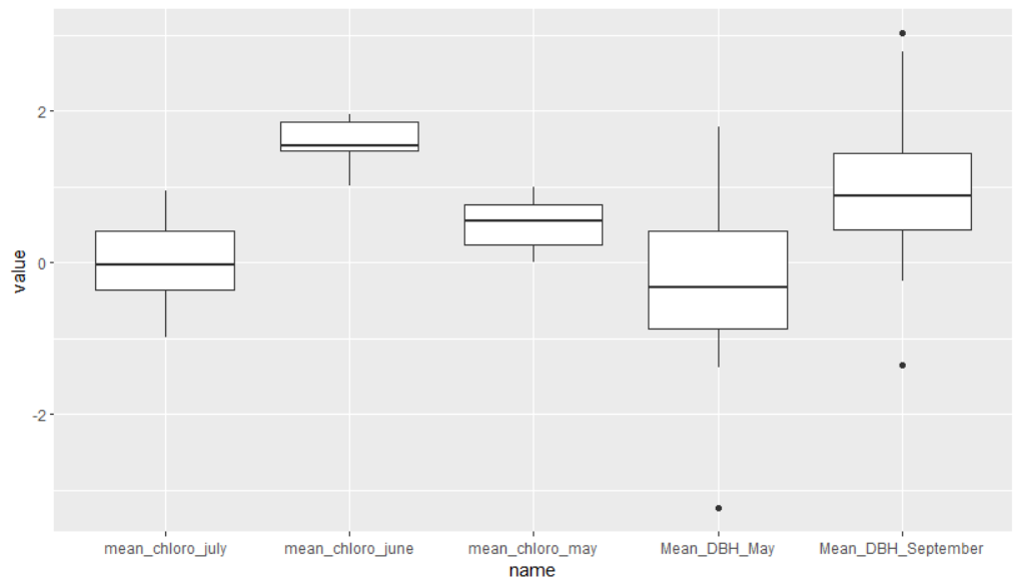
here is an extension with a second dataframe integrated.
this is simply repeating the data prep, and vertically stacking the data before charting.
library(tidyverse)

library(tidyverse)

#Generate random data
(ChloroCont = data.frame(
  mean_chloro_may = runif(20, 0, 1),
  mean_chloro_june = runif(20, 1, 2),
  mean_chloro_july = runif(20, -1, 1)
))

(MeanDBH = data.frame(
  Mean_DBH_May = rnorm(20),
  Mean_DBH_September=rnorm(20,mean=1)
))

#Convert them to a long format
(long_1 = ChloroCont %>% pivot_longer(everything()))
(long_2 = MeanDBH %>% pivot_longer(everything()))

stacked <- bind_rows(long_1,long_2)
#Plot using ggplot
ggplot(stacked, aes(x=name,y= value, group = name)) +
  geom_boxplot()
I am sorry, I did not see it in the previous reply. I see it now in yours. I will try to get it to work on my own based on your code. Thank you very much for your help.