April
June 12, 2021, 6:40pm
1
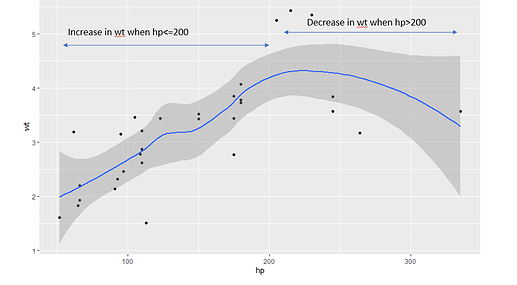
Considering the mtcars dataset, I'm trying to plot a scatter plot.
ggplot(mtcars,
       aes(x = hp,
           y = wt)) +
  geom_point() +
  stat_smooth()
I know how to create an arrow to label data values using annotations in R but how can I create a bidirectional arrow as annotation? I'm wondering if below figure could be created in plotly R using annotations
Hi @April ,
My solution to the arrows is using 2x geom_segment () . Probably there are nicer ways, but it works.
ggplot(mtcars, aes(x = hp, y = wt)) + geom_point() + stat_smooth() + geom_segment(aes(x = 100, y=5, xend=200, yend=5), lineend = 'square', linejoin = 'round', size = 2, arrow = arrow(length=unit(0.5, "cm" ))) + geom_segment(aes(x = 100, y=5, xend=50, yend=5), lineend = 'square', linejoin = 'round', size = 2, arrow = arrow(length=unit(0.5, "cm" )))
Hope this gets you going.
JW
April
June 12, 2021, 8:52pm
3
Hi @Jwvz001 ,
Thank you for your response!
Hi @April , you're welcome. Just out of curiousity, did you accomplish where you're after? Or did you find a nicer solution?
JW
April
June 14, 2021, 2:59am
5
Hi @Jwvz001 , I did accomplish my task with the help of your code snippet. I couldn't find any other solution.
system
June 21, 2021, 2:59am
6
This topic was automatically closed 7 days after the last reply. New replies are no longer allowed.
