Hi Simon!
If I understand you correctly, you can do the plot like this:
library(tidyverse)
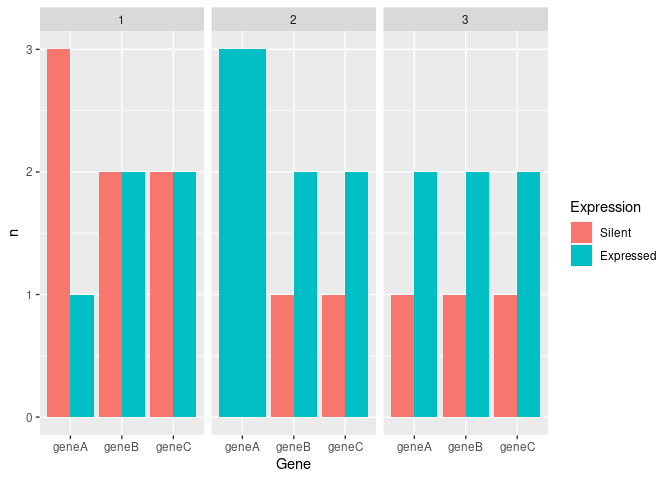
mydf <- data.frame(geneA = c(0,1,0,1,1,1,1,0,1,0), geneB = c(0,1,1,1,1,0,0,1,1,0), geneC = c(0,1,1,1,0,0,1,1,0,1) ,cluster = c(1,3,1,2,1,3,2,3,2,1))
#Convert data
mydf_long<-mydf%>%pivot_longer(starts_with("gene"),names_to="Gene",values_to="Expression")
#Count occurrences per cluster
mydf_count<-mydf_long%>%group_by(cluster,Gene,Expression)%>%tally()
mydf_count%>%
ggplot(aes(x=Gene,y = n,fill=factor(Expression)))+
geom_bar(stat = "identity",position = "dodge")+
facet_wrap(~cluster)+
scale_fill_discrete(name = "Expression", labels = c("Silent", "Expressed"))
Created on 2021-01-12 by the reprex package (v0.3.0)
Explanation:
At first, I convert your data into the long format, so that every observation has its own row. Then I count how many times each gene expressed / silent in each cluster and create the bar chart per cluster.
Is that the kind of visualisation you were thinking of?