Create a time interval for y axis

Hi,

I'm creating a chart with time in y axis. I need to set time intervals so that it doesn't displays time in specific intervals rather than all time.

I tried using scale_y_datetime(date_breaks = "3 hours", date_labels = "%H:%M")

but this doesn't return anything.

Regards,
Ash

What is your dataset like? Is it in a time format? Can you provide a reproducible example?

Hi,

My data is as follows:

flights attribute Value
Emirates ETA 9/09/2021 12:30
Emirates Arr Time 9/09/2021 14:50:00 PM
Turkish Airlines ETA 9/09/2021 17:30:00 PM
Turkish Airlines Arr Time 9/09/2021 18:50:00 PM
Cathay Pacific ETA 9/09/2021 19:30:00 PM
Cathay Pacific Arr Time 9/09/2021 14:50:00 PM
Qatar Airways ETA 9/09/2021 20:30:00 PM
Qatar Airways Arr Time 9/09/2021 20:50:00 PM
Lefthansa ETA 9/09/2021 12:30
Lefthansa Arr Time 9/09/2021 13:50

R code is as follows:

library(ggplot2)
library(plotly)

dataset$Value <-as.date(hms(dataset$Value),format="%H:%M:%S")

c1_data <-dataset
dataset$Value <-as.POSIXct(dataset$Value, format="%H:%M")

c1_graph <- ggplot(dataset,aes(workflow_code,Value, fill= Attribute)) +
geom_col(position = position_dodge())
c1_graph

Clean up your dataset. Where is as.date() from? Where is workflow_code? You don't need plotly here as you don't use it.

Here is something that is readable:

library(tidyverse)
library(lubridate)
dataset <- tibble::tribble(
            ~flights, ~attribute,                  ~Value,
          "Emirates",      "ETA",       "9/09/2021 12:30:00",
          "Emirates", "Arr Time", "9/09/2021 14:50:00 PM",
  "Turkish Airlines",      "ETA", "9/09/2021 17:30:00 PM",
  "Turkish Airlines", "Arr Time", "9/09/2021 18:50:00 PM",
    "Cathay Pacific",      "ETA", "9/09/2021 19:30:00 PM",
    "Cathay Pacific", "Arr Time", "9/09/2021 14:50:00 PM",
     "Qatar Airways",      "ETA", "9/09/2021 20:30:00 PM",
     "Qatar Airways", "Arr Time", "9/09/2021 20:50:00 PM",
         "Lefthansa",      "ETA",       "9/09/2021 12:30:00",
         "Lefthansa", "Arr Time",       "9/09/2021 13:50:00"
  ) %>% 
  mutate(Value = dmy_hms(Value))

Just to give you bit more context:

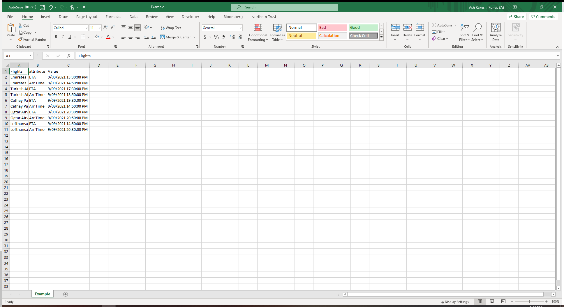
I have created a csv file in the format below:

Example

data <- read.csv("Example.csv")

names(data)[1] <- "Flights"

dataset$Value <- as.POSIXct(dataset$Value, format = "%Y-%m-%d %H:%M:%S")
c1_graph <- ggplot(data, aes(Flights,Value, fill= attribute)) +
geom_col(width=0.4, position=position_dodge(width=0.5)) +
#scale_y_datetime(limits = c(as.POSIXct("2021-09-09 11:00:00"),as.POSIXct("2021-09-10 20:00:00")))
coord_flip()

c1_graph

Using the R code above, my graph displays all datetime intervals in y axis

I dont need all numbers in y axis. I only need every 1 hour displayed.

Hope this gives you more clarity

Using my dataset above, because yours is not reproducible (read the article!)

ggplot(dataset, aes(flights, Value)) + 
  geom_line() + 
  scale_y_datetime(limits = c(ymd_hms("2021-09-09 11:00:00"), ymd_hms("2021-09-09 20:00:00"))) +
  coord_flip()

Hi @williaml

Thanks for your input. Sorry for the confusion. I'm pretty new to R and is trying to learn things as I progress.

I have now come up with the R code for this example:

library(ggplot2)

dataset <- tibble::tribble(
~flights, ~attribute, ~Value,
"Emirates", "ETA", "12:30:00",
"Emirates", "Arr Time", "14:50:00 PM",
"Turkish Airlines", "ETA", "17:30:00 PM",
"Turkish Airlines", "Arr Time", "18:50:00 PM",
"Cathay Pacific", "ETA", "19:30:00 PM",
"Cathay Pacific", "Arr Time", "14:50:00 PM",
"Qatar Airways", "ETA", "20:30:00 PM",
"Qatar Airways", "Arr Time", "20:50:00 PM",
"Lefthansa", "ETA", "12:30:00",
"Lefthansa", "Arr Time", "13:50:00"
)

c1_graph <- ggplot(dataset, aes(flights,Value, fill= attribute)) +
geom_col(width=0.4, position=position_dodge(width=0.5)) +

coord_flip()
c1_graph

In y axis, I would only want to see 13:50:00, 17:30:00 and 19:30:00.
scale_y_datetime does not seem to work, as I dont have date in the dataset.
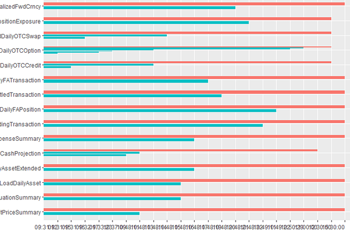
That makes an odd looking plot but this is how you can get it

library(tidyverse)
library(hms)

dataset <- tibble::tribble(
    ~flights, ~attribute, ~Value,
    "Emirates", "ETA", "12:30:00",
    "Emirates", "Arr Time", "14:50:00 PM",
    "Turkish Airlines", "ETA", "17:30:00 PM",
    "Turkish Airlines", "Arr Time", "18:50:00 PM",
    "Cathay Pacific", "ETA", "19:30:00 PM",
    "Cathay Pacific", "Arr Time", "14:50:00 PM",
    "Qatar Airways", "ETA", "20:30:00 PM",
    "Qatar Airways", "Arr Time", "20:50:00 PM",
    "Lefthansa", "ETA", "12:30:00",
    "Lefthansa", "Arr Time", "13:50:00"
)

dataset %>% 
    mutate(Value = as_hms(str_remove(Value, "\\s[PA]M$"))) %>% 
    ggplot(aes(x = Value, y = flights, fill = attribute)) +
    geom_col(position = "dodge") +
    scale_x_time(breaks = as_hms(c("13:50:00", "17:30:00",  "19:30:00"))) +
    theme(axis.text.x = element_text(angle = 45, hjust = 1, vjust = 1))

Created on 2021-09-16 by the reprex package (v2.0.1)

1 Like

This topic was automatically closed 21 days after the last reply. New replies are no longer allowed.

If you have a query related to it or one of the replies, start a new topic and refer back with a link.