Hi,
I have a table of data, example:
tibble::tribble(
~Item, ~'0', ~'1',
"123", '30', '40',
"213", '20', '50',
"321", '10', '60',
)
I am trying to make a bar plot with ggplot2, that shows each material on x axis and the value of column '1' on y axis
I tried this code:
ggplot(dt, aes(x = Material, y= '1', group = Material, color = Material))+
  geom_bar(stat = "identity")
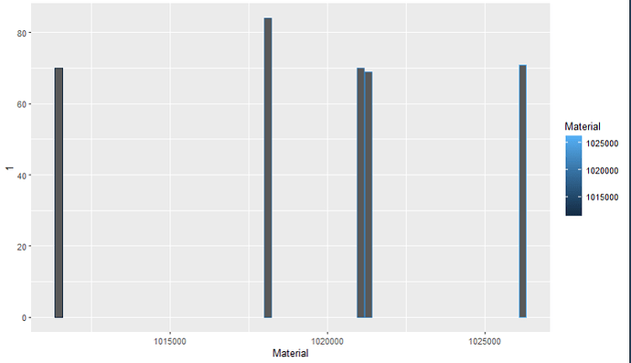
but this is the result:
Ven
2
This variable should not be in single-quotes.
`1` # Should use the grave accent
Ven
4
Based on this, I assume "Material" is numeric, which is why it's structuring the x-axis in that way.
is there a way to convert it to categorical?
got it used as.character and it looks good now, thank you very much!!!
1 Like
system
Closed
7
This topic was automatically closed 7 days after the last reply. New replies are no longer allowed.
If you have a query related to it or one of the replies, start a new topic and refer back with a link.

