Create a percentage stacked bar chart

I'm trying to create a percentage stacked column and here are my problems;

The labels on the column are not properly positioned
I have variables called (Q4 2017, Q1 2018, Q2 2018, Q3 2018, Q4 2018) representing the quarters in a year that are to be compared. Q4 2017 should come first but I guess R is placing the columns in alphabetical order and so Q1 - Q3 2018 come before Q4 2017 and finally Q42018 on the plot. How can I possibly reorganise this presentation?

'''r
ggplot(trend, aes(x = quarter,
y = number,
fill = rating)) +
geom_col(position = "stack", width = 0.4) +
ylab("Number of Lots") +
xlab(" ") +
geom_text(data = trend, aes(x = quarter,
y = number,
label = paste0(number,"%")),
colour = "white", vjust = -5, size = 3) +
scale_fill_discrete(name = "Lots", labels = c(">= 80%", "50 - 79.9%",
"25 - 49.9%", "< 25%"))
'''

Hi nets,

welcome to the RStudio Community and your first topic! :slight_smile:
Below you will (may) find one possible solution for your posted problem, based on your minimal information. Try to use 'reprex' in future., it's a quite cool tool.

I've tried to restore your overall problem as good as possible with my reprex, but I'm not sure what your data looks like, especially for your labeling problem I may have misinterpreted your question... :wink:

library(tibble)
library(ggplot2)
library(tidyr)
library(dplyr)

#create some reprex data for testing of your output
set.seed(1234)
trend <- tibble('Q4 2017'=sample(c('< 25%','25 - 49.9%', '50 - 79.9%', '>= 80%'), 500, replace=TRUE),
                'Q1 2018'=sample(c('< 25%','25 - 49.9%', '50 - 79.9%', '>= 80%'), 500, replace=TRUE),
                'Q2 2018'=sample(c('< 25%','25 - 49.9%', '50 - 79.9%', '>= 80%'), 500, replace=TRUE),
                'Q3 2018'=sample(c('< 25%','25 - 49.9%', '50 - 79.9%', '>= 80%'), 500, replace=TRUE),
                'Q4 2018'=sample(c('< 25%','25 - 49.9%', '50 - 79.9%', '>= 80%'), 500, replace=TRUE)) %>% 
  gather(key='quarter', value='rating') %>% 
  #set your factor order
  mutate(quarter=factor(quarter, levels = c('Q4 2017','Q1 2018','Q2 2018','Q3 2018','Q4 2018'))) %>% 
  #set factors here in descending order to get the 'Lots' order you would like
  mutate(rating=factor(rating, levels = c('>= 80%','50 - 79.9%','25 - 49.9%','< 25%'))) %>% 
  group_by(quarter,rating) %>% 
  summarise('number'=n()) %>% 
  ungroup() %>% 
  #calculate the position (cumulative sums) for each column by hand and use later for ggplot
  arrange(quarter,desc(rating)) %>% 
  mutate('cumsums'=unlist(by(data = number, INDICES = quarter, FUN = cumsum)))

ggplot(data = trend, aes(y=number, x=quarter, fill=rating)) + 
  geom_bar(stat="identity", width = 0.5) + 
  xlab('') + ylab('Numbers of Lots') +
  #use 'cumsums' to set the 'value'-labels on the correct position for each bar
  #and adjusted position by hand '-10'...
  geom_text(aes(x = quarter, y = cumsums-10, label = number),
            colour = "white") + 
  labs(fill='Lots')
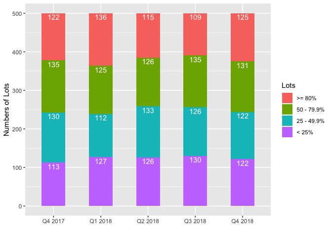
Created on 2019-03-15 by the reprex package (v0.2.1)

3 Likes

Thanks, adam83, for the warm welcome and of course the neat code.
So I ran your code and it does exactly what I was hoping to achieve but it seems my dataset has a different structure and I'm struggling to get it to work. Sadly I couldn't add a screenshot of the table as newbies could only upload one image.

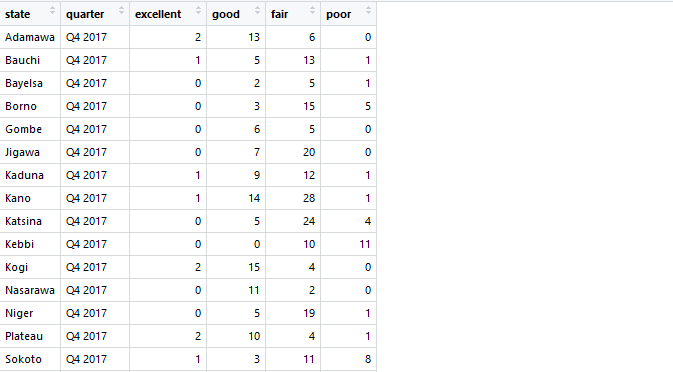
So the table below shows what my table looks like. It has states, the quarters and the rating.
table

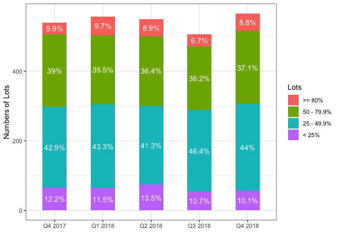
From the table, each State has values across the ratings (Excellent [>80%] to Poor [<25%]) for every quarter (Q4 2017 to Q4 2018). However, in creating my plot, I'm not interested in the States. I want to show, as you've done, the sum of values per rating per quarter. And the column labels in percentage.

1 Like

You can avoid having to specify the y position of the text labels explicitly by using position_stack. For example, if you do

  geom_text(aes(x = quarter, label = number),
            colour = "white", position=position_stack(vjust=0.9)) + 

the text labels will be positioned near the top of each bar component. You can vertically center the text labels with:

  geom_text(aes(x = quarter, label = number),
            colour = "white", position=position_stack(vjust=0.5)) + 
1 Like

Hi nets,

below you will find a solution based on your data structure and also joels nice solution for the label position. If you get in struggle with your data, don't hesitate to ask. :wink:

@joels Thanks, for the nice hint! :slight_smile:

Best regards
Adam

library(tibble)
library(ggplot2)
library(tidyr)
library(dplyr)

#create some reprex data based on your your data structure / example
set.seed(1234)
yourdata <- tibble('state'=sample(letters, size = 100, replace = TRUE),
                   'quarter'=rep(c('Q4 2017','Q1 2018','Q2 2018','Q3 2018','Q4 2018'), each = 20),
                   'excellent'=rbinom(n=100, size = 20, prob = 0.1),
                   'good'=rbinom(n=100, size = 20, prob = 0.5),
                   'fair'=rbinom(n=100, size = 20, prob = 0.6),
                   'poor'=rbinom(n=100, size = 20, prob = 0.15))
head(yourdata)
#> # A tibble: 6 x 6
#>   state quarter excellent  good  fair  poor
#>   <chr> <chr>       <int> <int> <int> <int>
#> 1 c     Q4 2017         0    11    13     4
#> 2 q     Q4 2017         2    10     7     3
#> 3 p     Q4 2017         1     9    12     4
#> 4 q     Q4 2017         1    12    12     4
#> 5 w     Q4 2017         1    10     8     3
#> 6 q     Q4 2017         1    11    12     2

#prepare your data for the visualization of interest
trend <- yourdata %>% 
  #drop state
  select(-state) %>% 
  #rename the colnames based on your information
  rename('>= 80%'='excellent',
         '50 - 79.9%'='good',
         '25 - 49.9%'='fair',
         '< 25%'='poor') %>% 
  #transform data from wide to long with variables of choice 
  gather(`>= 80%`,`50 - 79.9%`,`25 - 49.9%`,`25 - 49.9%`,`< 25%`,
         key='rating', value='value') %>% 
  #set your factor order
  mutate(quarter=factor(quarter, levels = c('Q4 2017','Q1 2018','Q2 2018','Q3 2018','Q4 2018'))) %>% 
  #set factors here in descending order to get the 'Lots' order you would like
  mutate(rating=factor(rating, levels = c('>= 80%','50 - 79.9%','25 - 49.9%','< 25%'))) %>% 
  #calculate the sum of each rating by quarter
  group_by(quarter,rating) %>% 
  summarise('number'=sum(value)) %>% 
  ungroup() %>% 
  #calculate percentage for column labels
  mutate('relative'=unlist(by(data = number, INDICES = quarter, 
                              FUN = function(x) round(x/sum(x)*100, digits = 1))))

#create the stacked bar plot based on your data
ggplot(data = trend, aes(y=number, x=quarter, fill=rating)) + 
  geom_bar(stat="identity", width = 0.5) + 
  xlab('') + ylab('Numbers of Lots') +
  #use JOELS great solution for the label position 
  #and add percentage based on variable 'relative', otherwise use 'number'
  geom_text(aes(x = quarter, label = paste0(relative,'%')),
            colour = 'white', position=position_stack(vjust=0.5)) + 
  labs(fill='Lots') + theme_bw()

Created on 2019-03-18 by the reprex package (v0.2.1)

3 Likes

This topic was automatically closed 21 days after the last reply. New replies are no longer allowed.

If you have a query related to it or one of the replies, start a new topic and refer back with a link.