Dear all,
I do apologise in advance but I'm not an R expert (at all). I used R rarely and the last time, I had to convert my data as tibble in order to plot them correctly, and now I did the same but I believe it would be better to convert them into POSIXct (but I don't know how to do it ![]() )
)
I have this csv:
structure(list(Date = c("01/02/2003 01:01:01", "01/03/2003 01:01:01",
"01/04/2003 01:01:01", "01/05/2003 01:01:01", "01/06/2003 01:01:01",
"01/07/2003 01:01:01", "01/08/2003 01:01:01", "01/09/2003 01:01:01",
"01/10/2003 01:01:01", "01/11/2003 01:01:01", "01/12/2003 01:01:01",
"01/01/2004 01:01:01", "01/02/2004 01:01:01", "01/03/2004 01:01:01",
"01/04/2004 01:01:01", "01/05/2004 01:01:01", "01/06/2004 01:01:01",
"01/07/2004 01:01:01", "01/08/2004 01:01:01", "01/09/2004 01:01:01",
"01/10/2004 01:01:01", "01/11/2004 01:01:01", "01/12/2004 01:01:01",
"01/01/2005 01:01:01", "01/02/2005 01:01:01", "01/03/2005 01:01:01",
"01/04/2005 01:01:01", "01/05/2005 01:01:01", "01/06/2005 01:01:01",
"01/07/2005 01:01:01", "01/08/2005 01:01:01", "01/09/2005 01:01:01",
"01/10/2005 01:01:01", "01/11/2005 01:01:01", "01/12/2005 01:01:01",
"01/01/2006 01:01:01", "01/02/2006 01:01:01", "01/03/2006 01:01:01",
"01/04/2006 01:01:01", "01/05/2006 01:01:01", "01/06/2006 01:01:01",
"01/07/2006 01:01:01", "01/08/2006 01:01:01", "01/09/2006 01:01:01",
"01/10/2006 01:01:01", "01/11/2006 01:01:01"), Pz1 = c(0.53,
0.25, 0.3, 0.51, 0.23, 0.52, 0.48, 0.36, 0.56, 0.27, 0.44, 0.28,
0.79, 0.15, 0.73, 0.44, 0.5, 0.26, 0.1, 0.26, 0.69, 0.38, 0.51,
0.39, 0.42, 0.29, 0.68, 0.62, 0.5, 0.06, 0.29, 0.13, 0.6, 0.21,
0.34, 0.17, 0.39, 0.21, 0.89, 0.19, 0.44, 0.53, 0.55, 0.89, 0.55,
0.65), Pz2 = c(0.62, 0.99, 0.87, 0.77, 0.51, 0.66, 0.4, 0.68,
0.87, 0.13, 0.81, 0.29, 0.11, 0.11, 0.23, 0.71, 0.85, 0.05, 0.78,
0.32, 0.16, 0.54, 0.65, 0.09, 0.97, 0.81, 0.49, 0.36, 0.37, 0.78,
0.04, 0.67, 0.91, 0.12, 0.34, 0.3, 0.71, 0.04, 0.73, 0.33, 0.59,
0.23, 0.82, 0.04, 0.04, 0.82), Pz3 = c(0.2, 0.76, 0.04, 0.39,
0.58, 0.49, 0.44, 0.12, 0.16, 0.12, 0.95, 0.95, 0.08, 0.68, 0.57,
0.49, 0.58, 0.46, 0.39, 0.51, 0.69, 0.09, 0.68, 0.18, 0.3, 0.75,
0.76, 0.85, 0.17, 0.6, 0.45, 0.26, 0.65, 0.07, 0.7, 0.71, 0.47,
0.79, 0.58, 0.08, 0.37, 0.86, 0.23, 0.31, 0.06, 0.1), Pz4 = c(0.21,
0.65, 0.67, 0.45, 0.32, 0.79, 0.94, 0.78, 0.73, 0.83, 0.79, 0.46,
0.07, 0.84, 0.25, 0.27, 0.77, 0.37, 0.16, 0.67, 0.88, 0.67, 0.87,
0.95, 0.63, 0.61, 0.21, 0.21, 0.4, 0.74, 0.62, 0.22, 0.08, 0.67,
0.2, 0.18, 0.83, 0.3, 0.15, 0.7, 0.5, 0.43, 0.81, 0.17, 0.31,
0.66), Pz5 = c(0.57, 0.78, 1, 0.87, 0.88, 0.5, 0.24, 0.71, 0.11,
0.4, 0.08, 0.2, 0.67, 0.41, 0.28, 0.45, 0.6, 0.18, 0.27, 0.02,
0.96, 0.48, 0.95, 0.01, 0.8, 0.07, 0.34, 0.09, 0.19, 0.59, 0.34,
0.66, 0.48, 0.86, 0.97, 0.76, 0.93, 0.21, 0.5, 0.93, 0.41, 0.33,
0.32, 0.12, 0.42, 0.94), Pz6 = c(0.42, 0.34, 0.34, 0.73, 0.7,
0.67, 0.09, 0.45, 0.55, 0.88, 0.05, 0.15, 0.85, 0.02, 0.42, 0.14,
0.68, 0.71, 0.57, 0.14, 0.85, 0.81, 0.2, 0.97, 0.42, 0.59, 0.23,
0.39, 0.5, 0.87, 0.37, 0.63, 0.7, 0.3, 0.33, 0.29, 0.9, 0.75,
0.38, 0.17, 0.87, 0.45, 0.79, 0.74, 0.21, 0.05)), class = "data.frame", row.names = c(NA,
-46L))```
Now...
So far I managed to get them into the plot style I need, using the following code:
a=read.csv("C:/Users/simon/Desktop/4.csv")
b=a
c=b %>%
    mutate(Date = dmy_hms(Date)) %>%
    arrange(Date) %>%
    as_tbl_time(index = Date)
df=c
df_melt = melt(df, id= "Date")
d=ggplot(df_melt, aes(x = Date, y = value)) +
    geom_line() +
    facet_wrap(~ variable, scales = 'free_y', ncol = 2)
d+theme_bw()
``
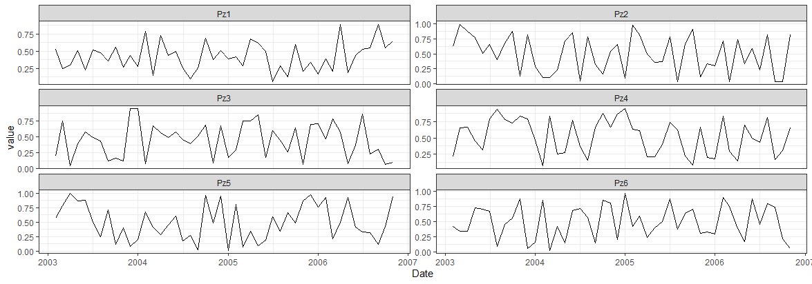
Which gives this:
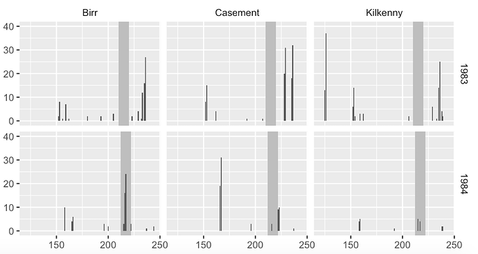
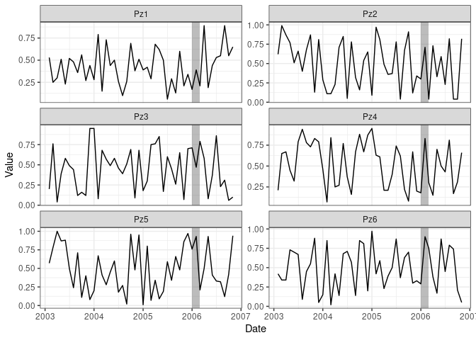
I know, it's absolutely horrible, but it was the only way I remember. What I do really need is to add a shaded rectangle in every plot (at the same date); something like this, for instance:
Could you kindly help me with this matter, please?
I don't mind changing the data format to POSIXct (if required for ggplot), anything really, as long as it looks like this.
Thanks a lot!
P.S. I don't need the data with the time (i.e., 01:01:01 can be removed if needed!)


