Create a heatmap-like table

Dear all,

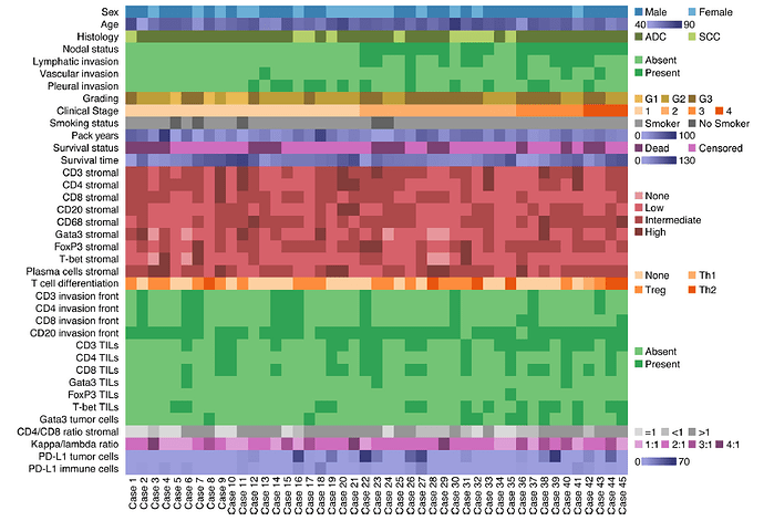
how ist it possible to create this/or a similar heatmap-like table (see below) using the following data set

Does converting the character variables to numeric ones help in the first place?

Case sex Age type subtype localisation
1 1 w 68 IPNB pancreatobiliary distal
2 2 m 62 IPNB pancreatobiliary distal
3 3 w 53 IPNB intestinal intrahepatic
4 4 m 59 IPNB pancreatobiliary distal
5 5 w 55 ITPN pancreatobiliary intrahepatic
6 6 m 69 ITPN pancreatobiliary intrahepatic

Thank you so much for taking your time to help this VERY desperate person right now...
1 Like

If you need an image, it can be done in {ggplot}, and a table can be done in [gt] with greater difficulty. This will be challenging either way because of the large amount of data to be shown.

  1. It seems you can buy it for 1.000 Yen at weinformatics.cn:
    基于数据建模与人工智能的生物标志物应用生信分析定制化 – 恒诺新知
    (this link and then 1 left)
  2. where do you found it, I assume it's a publication, maybe it's worth to ask the authors.
  3. To me it seems like a heatmap. However the difficulty is that group of categories are using their own colour-scheme. I never tried to do this - it's not simple. So either it is somehow a composite or there is a feature I don't know. My first idea for a workaround would to define all of these as annotation column (either with pheatmap or complexheatmap) and just drop the heatmap. Example here: https://www.datanovia.com/en/lessons/heatmap-in-r-static-and-interactive-visualization/ then scroll down to annotion.
  4. The labels on the right side are probably rearranged afterwards.

This topic was automatically closed 42 days after the last reply. New replies are no longer allowed.

If you have a query related to it or one of the replies, start a new topic and refer back with a link.