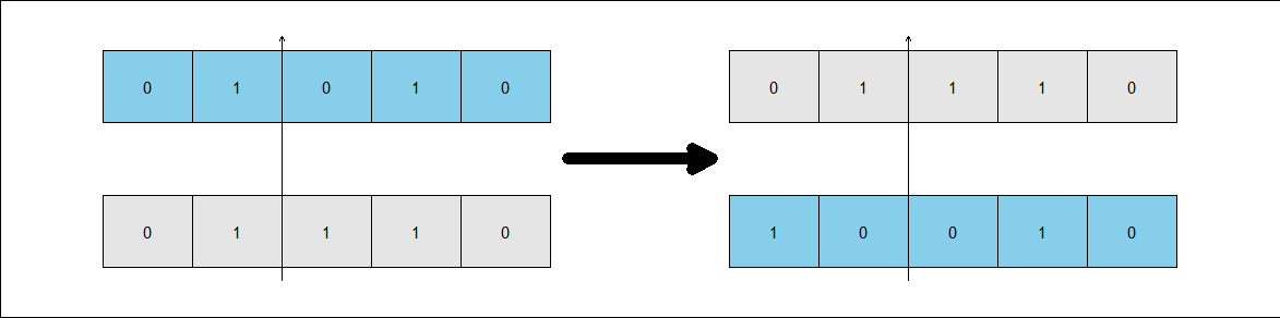
I would like to create two similar rectangles next to the two I created. Insert the arrow too, as per the expected image I put below. However, these two new rectangles have no colors and no point P. For these new rectangles, the values are c(0, 1, 1, 1, 0) and c(1, 0, 0, 1, 0).
rectangle_width <- 1
rectangle_height <- 0.2
square_width <- 0.2
square_height <- 0.2

# Function to create a rectangle and add numbers inside
create_rectangle <- function(position_x, position_y, numbers, color) {
  # Create rectangle
  rect(position_x, position_y, position_x + rectangle_width, position_y + rectangle_height, border = "black", col = color)

  # Add numbers in the squares
  for (i in 1:length(numbers)) {
    square_position_x <- position_x + (i - 1) * square_width
    square_position_y <- position_y
    rect(square_position_x, square_position_y, square_position_x + square_width, square_position_y + square_height, border = "black")
    text(square_position_x + square_width/2, square_position_y + square_height/2, numbers[i], cex = 1.5, col = "black")
  }
}

# Create the plot
plot.new()

# First rectangle
numbers_rectangle1 <- c(0, 1, 0, 1, 0)
color_rectangle1 <- "lightblue"
  create_rectangle(0, 0.4, numbers_rectangle1, color_rectangle1)

  # Second rectangle
  numbers_rectangle2 <- c(0, 1, 1, 1, 0)
  color_rectangle2 <- "white"
    create_rectangle(0, 0, numbers_rectangle2, color_rectangle2)

    # Coordinates of the line and the "P" text
    line_x <- square_width * 2
    line_y <- 0.3 + square_height/2
    text_x <- square_width * 2 + square_width/2
    text_y <- 0.4 + square_height + 0.04

    # Add line and "P" text
    segments(line_x, line_y, line_x, line_y + square_height, lwd = 3)
    text(text_x, text_y, "P", cex = 1.5, col = "black", pos = 2)
Output:
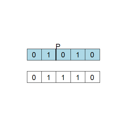
Expected output: