Covid-O-Meter
Authors: Albert Henry
Working with Shiny < 1 year
Abstract: Covid-O-Meter is an open access, interactive web-based dashboard designed to track and visualise various global statistics related to the Covid-19 pandemic. Covid-O-Meter uses publicly available, daily updated Covid-19 dataset by John Hopkins University which collects records from various areas and countries over the world. Using Covid-O-Meter, users can calculate and visualise the number of cases and deaths, daily case and death growth rate, and case fatality rate per country. The interactivity allows users to quickly explore and compare statistics from different combinations of countries and adjust various parameters to tune the graphs.
Full Description: ### Background
The ongoing Covid-19 pandemic is a complex problem which has affected the lives of many people and destabilized foundations of societies worldwide. Since the beginning of the outbreak, the The Center for Systems Science and Engineering (CSSE) at John Hopkins University has been collecting daily updated data on the number of cases and deaths related to Covid-19 from various almost all affected regions and countries worldwide.
This valuable dataset has been utilised to build visualisations, mathematical models, and various statistics of the disease spread over time. Each of these projects has its own perks and tells a different story. For a rapidly evolving problem such as Covid-19, however, narratives on specific topics on certain populations or areas at certain periods may not always fit well in other contexts. A combination of domain expertise and local knowledge is often required to make sense of a specific subset of the data.
To aid this time-consuming data sleuthing work, Covid-O-Meter provides a simple web-based dashboard which allows users with relevant expertise to navigate through different parts of the dataset directly so that they can make their own discoveries. The scale of the data combined with the accessibility and flexibility of Covid-O-Meter makes it easy to calculate and keep track of country-specific key statistics at a certain period of time – a powerful feature for any user, particularly those with little experience in infectious disease epidemiology or in a resource-limited settings.
Contents
As per April 2, 2020, Covid-O-Meter can provide the following information:
Case statistics
- Cumulative Number of cases
- Number of new cases
Death statistics
- Cumulative number of deaths
- Number of new deaths
- Case fatality rate = Number of deaths (cumulative) / Number of cases (cumulative)
Animation
- Number of cases (per-day time-lapse)
- Number of deaths (per-day time-lapse)
Plots
Covid-O-Meter combines powerful features from shiny, tidyverse, ggplot2, and ggiraph packages to create interactive visualisations. Extension packages such as ggrepel, ggthemes, shinyWidgets, and shinycustomloader are added to improve user experience.
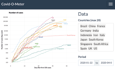
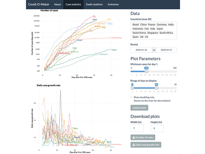
Plots in Covid-O-Meter are a combination scatter plot and line chart on a two axes Cartesian coordinate system.
The Y-axis represents the corresponding statistics on a log base 2 scale (number of cases / deaths) or a linear scale (daily case / death growth rate and case fatality rate). The logarithmic base 2 scale is used to represent the doubling rate of the number of cases / deaths due to the exponential nature of the disease spread.
The X-axis represents day after first N cases (for case statistics) / deaths (for death statistics) on a one-unit increase linear scale, with N being the minimum number of cases / deaths to count as day 1.
Interactive elements
On mouse hover, each data point will show country name, date, day after first N cases / deaths (X-axis coordinate), and value of the statistics (Y-axis coordinate).
The draggable sidebar allows users to adjust various data and plot parameters, including:
- Add / remove countries
- Adjust range of dates to use in calculation
- Adjust minimum number of cases / deaths to be counted as Day 1
- Adjust range of days to display
- Change between linear / log scale
- Show doubling rate
All plots can also be downloaded as a static image.
Animation
Covid-O-Meter uses the gganimate package to produce an animated gif of per-day time lapse of the cumulative number of cases / deaths. Users can freely adjust countries and plot parameters, create their own animation, and save it to a local machine.
Category: Research
Keywords: Health data science, epidemiology, biostatistics, data visualization
Shiny app: https://alhenry.shinyapps.io/covid-o-meter/
Repo: GitHub - alhenry/covid-o-meter: Global Covid-19 Tracker
RStudio Cloud: Posit Cloud
Thumbnail:

Full image:
