COVID-19 School Dashboard
Authors:
- Peter J. Taylor (@br00t)
- Connor Cozens (@connor-cozens)
- Justin Marshall (@JustinMarshall)
- Prachi Srivastava (@pisri)
Abstract: The COVID-19 School Dashboard maps and visualizes COVID-19 cases in publicly funded elementary and secondary schools in Ontario. It connects COVID-19 school data with school social background characteristics for education equity-related analysis.
Full Description:
Rationale and Objectives: Why the app?
Ontario has had the longest pandemic-related education disruption in Canada, affecting over 2 million students, the largest cohort in the country. Ontario is also the worst-affected province in Canada with the highest number of cumulative cases. There are strong equity concerns. The effects of COVID-19 are more severe on high-risk communities, populations, and schools. While education is a hot topic in public discourse, accessible and easily understandable visual data was lacking. The COVID-19 School Dashboard was developed to address these gaps. We developed the site to: (1) provide more understandable visual information for broad consumption by the public and local communities; (2) enable equity-related research analysis for public policy.
Application Components and Data
Official public government-reported data on COVID-19 school cases is combined with a second official government public dataset on school-level demographics.
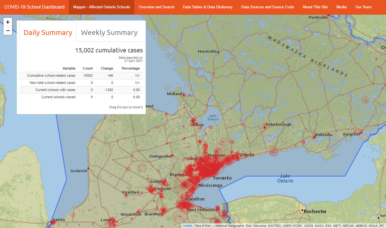
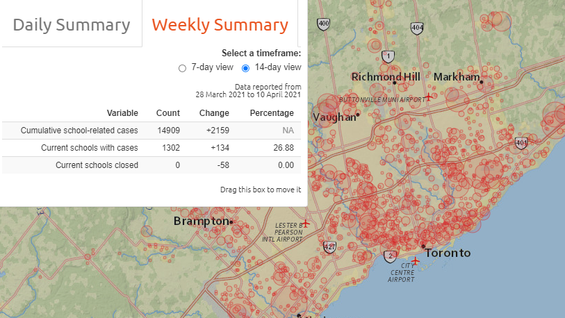
The main page (Mapper- Affected Schools in Ontario) and function of the COVID-19 School Dashboard comes from the mapping of reported data on COVID-19 cases reported daily by the Ontario Ministry of Education. This data is scraped by the application which keeps track of information such as collected and reported dates, school, region, etc. This data is used to calculate our daily and weekly summaries.
Using the reported location of each case, we used geocaching requests to map each case to coordinates for the visualization of cases as shown here.
Using the second dataset on school demographics from the Ministry of Education, we connected each school, and therefore, reported instances of COVID-19 cases in each school, with the social background characteristics of each school with breakouts.

For further formation and a more complete description see the ‘About This Site’ tab on the dashboard.
Value-added
While there are other public dashboards and visualization activities on COVID-19 school cases in Ontario, this is, to the best of our knowledge, the only one to combine these two datasets for a clearer picture of the potential equity effects on school communities, and to plot precise geographical locations of affected schools.
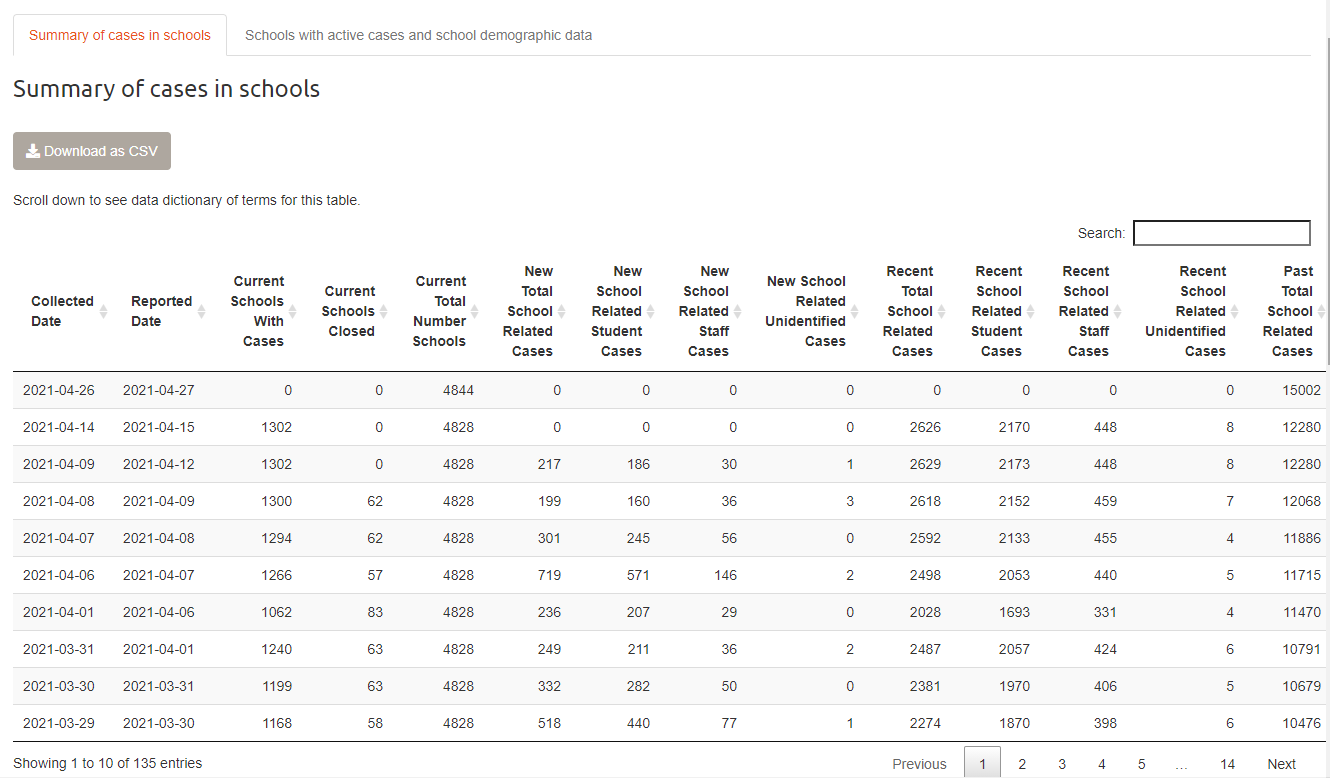
We use the raw datasets and combine them in a unique way to make them more usable and understandable for public consumption, and for eventual analysis to inform public policy for education recovery. The daily release of official COVID-19 school data was in tabular format. It was hard to discern and difficult to understand the intensity of school breakouts and their locations. The geographic understanding of where the breakouts were, was obscure, or if the affected school populations were from/in high-risk communities.
Visualizing COVID-19 school case data with data on school social background characteristics and mapping them provides: a better understanding of the scale of the breakouts; which schools are affected; what the geographic concentration of affected schools are; and details on the social background characteristics of affected school populations.
For example, relative bubble sizes immediately indicate which schools had larger breakouts compared to others. Hovering on a bubble gives the user more specific information about the cumulative COVID-19 case breakdown at the affected school (i.e., number of student, staff, unidentified) and about the make-up of the school population (e.g., proportion of student from low-income households and other relevant factors).
The cluster of bubbles in particular geographic locations, shows where the concentration of schools with breakouts are, indicating which geographic locations are relatively more affected than others. This generates a much more immediate intuitive understanding for users.
With the aim to increase transparency and public access, we also added charts and tables that are more accessible for general users to visualize rather than having to process Excel or CSV files. Users can also search for specific schools, school boards, or geographic locations for targeted information.

We provide public access to all data used for the dashboard. CSV files are available for experienced users to download and replicate analysis or to conduct their own. Users are welcomed to report data errors or discrepancies which we update.
What has it achieved?
Version 1.0 was released in November 2020. The dashboard has been widely accessed by the general public, parents, and community members. It has also been used by education stakeholders for better data-based understanding of the evolving education scenario. The dashboard has been covered in local, national, and international media. We think this is achieving our desired aims for transparency and public access to essential data. Modelling of the data is currently being conducted for research analysis and further dissemination.
In short, the dashboard helps us get closer to understanding the human dimension of COVID-19 on school populations and in specific geographic communities.
IMPROVEMENTS AND PLANS GOING FORWARD
Version 1.1 was released in May 2021 with updated policy analysis, data mismatch fixes, daily and 7- and 14-day summaries, fixes to data scraping, and ease of use including site navigation and load times.
Further improvements are planned, including:
- Time-slider to see the evolution of cases and affected schools for the 2020-2021 school year as final Ministry data are released
- Search functionality within mapping tool to find and center the map on specific regions, schools, and searchable attributes
- Mobile viewing and optimization
- Encoding issues cause accented characters to display improperly on the site. While the majority of the data does not include them, this issue is a high priority and a fix is currently in development.
Keywords: COVID-19, education, Canada, geocoding, leaflet, google maps
Shiny app: https://taypeinternational.shinyapps.io/covid19-ontario-schools/
Repo: GitHub - connor-cozens/covid19-school-dashboard: covid19schooldashboard.com reports and maps confirmed school-related cases of COVID-19 in publicly funded elementary and secondary schools in Ontario, Canada, and connects this to data on school social background characteristics (school-level demographic data).
RStudio Cloud: Posit Cloud
Thumbnail:
Full image: