2019nCov_demo
Authors: Chijie Chen
Working with Shiny < 1 year
Abstract: To show the COVID-19 situation in China from 2020-2-7 to 2020-3-14. To discorver the daily changes in the number of confirmed, cured, and dead patients at different times in different provinces different cities in China. Hope this demo can be helpful for the epidemic prevention and control. Stay strong, China! Keep fighting, the World!
Full Description: To show the COVID-19 situation in China from 2020-2-7 to 2020-3-14.
To discorver the daily changes in the number of confirmed, cured, and dead patients at different times in different provinces different cities in China.
Here are some detailed descriptions for this shinyApp.
(1) Homepage
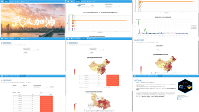
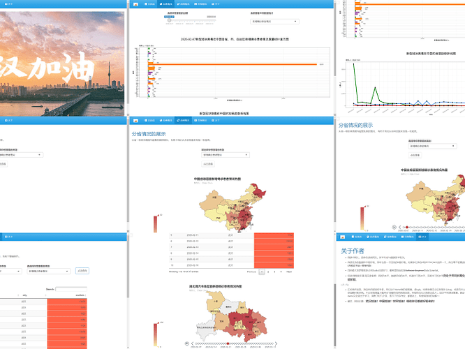
On the homepage, you will see a huge poster, which means cheer for Wuhan. As everyone knows, in order to control the epidemic, China closed the city of Wuhan in Hubei Province. The people of Wuhan have made significant contributions to the control of the epidemic. So I hope that after this epidemic, Wuhan will be able to stand up again and continue to be brilliant! Tribute to Wuhan!
(2) The second page
The second page is a summary of the development of the epidemic in China. You can see the difference visually in the first picture by changing the time (the time range is February 7, 2020 to March 14, 2020) and selecting different patient types (confirmed, cured and dead patients) Number of patients in the province. The second picture is a static picture, which shows the daily trend of diagnoses, cures, and deaths in China from February 7, 2020 to March 14, 2020. It can be discorvered that the epidemic situation has turned around in China.
(3) The third page
On this page, you can use a map to view the changes in the number of different types of patients in each province of China each day. The darker the color, the more people there are. You can select different types of patients to view.
(4) The fourth page
In addition to the province dimension, you can also view the number of patients in the city dimension. You can choose different provinces and different cities. You can see the number of patients in a specific city over time in a table. In the number of people column, the darker the fill, the more patients there are. In the map below, you can directly see the number of patients in each city in a province.
(5) The last page
This page is mainly about the author.
I hope this demo can be helpful for the epidemic prevention and control.
Stay strong, China!
Keep fighting, the World!
We are the world!
Category: Healthcare
Keywords: COVID-19, Visualization, China, Healthcare, Map, Demo
Shiny app: https://cooper-chen-pku.shinyapps.io/shiny_2019nCov_demo/
Repo: GitHub - CooperChen453/shiny_2019nCov_demo
RStudio Cloud: Posit Cloud
Thumbnail:

Full image:
