Covid-19 Dashboard by HBAP Team Shiny
Authors: Jeff Renz, Itauma Itauma, Ken Cutt
Working with Shiny < 1 year
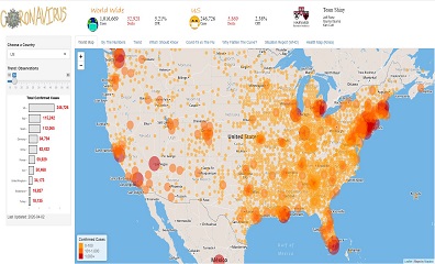
Abstract: The Covid-19 dashboard displays confirmed virus cases on a map with the ability to click on the county to view totals, a sortable data grid, and an interactive trend plot that allows users to pick how many days to go back in time.
Full Description: The Dashboard is updated daily show global and the selected county totals pulling data from an Azure SQL Server. The Dashboard map allows users to drill down/up to view virus totals and allows users to click the bubbles which represent counties to view virus cases and deaths. It has a trend plot which changes the number of bars as the use changes the input value with the slider.
There is a sortable data grid that provides totals by state. The dashboard also shows related information from other sites such as pdfs, videos, and interactive maps.
Category: Research
Keywords: Coronavirus, Covid-19, World Map of virus spread, Trend by country, Data by US States
Shiny app: https://jeff-renz.shinyapps.io/HBAPShiny2020/
Repo: GitHub - jeffrenz/HBAPShiny2020
RStudio Cloud: I was using R studio locally as I was loading the Azure SQL database using ODBC and didn't want to have timeouts.
Thumbnail: