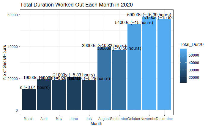
When I plot a graph, it is too cluttered because the data is being displayed in total seconds & hours. I just want it to be in hours so the data needs to display only in hours. Please help.
I am unable to figure out with the instructions you have shared. Do you have a solution to my problem? The graph, when I plot comes as below. It is too cluttered because it mentions the seconds & hours while I want it to only display hours.
# Data Frame with similar structure as yours:
WorkoutDur20 <-
  data.frame(Month = c("March", "April", "May", "June", "July", "August",
                       "September", "October", "November", "December"),
             Total_Dur20 = c("12942s (~3.6 hours)", "19185s (~5.33 hours)",
                             "18744s (~5.21 hours)", "20855s (~5.79 hours)",
                             "18560s (~5.16 hours)", "39327s (~10.92 hours)",
                             "37625s (~10.45 hours)", "53851s (~14.96 hours)",
                             "58633s (~16.3 hours)", "57199s (~15.87 hours)"))

# Substitute characters with blank space if not needed using regex
WorkoutDur20$Total_Dur20 <- gsub("[s|(|)|hours]", "", WorkoutDur20$Total_Dur20)

# Separate based on a specific value: Once again, you may need to use regex.
WorkoutDur20 <- separate(WorkoutDur20, Total_Dur20, into = c("Seconds", "Hours"), sep = " ~")

# After separating, you need to convert back to numeric
WorkoutDur20$Seconds <- as.numeric(WorkoutDur20$Seconds)
WorkoutDur20$Hours <- as.numeric(WorkoutDur20$Hours)

# Then create your ggplot.
# The fill seems redundant when you already have bars that tell the same story, but if you want it, you do you.
ggplot(WorkoutDur20, aes(x = factor(Month, levels = month.name), y = Hours #, fill = Hours
                         )) +
  geom_col() +

  geom_text(aes(label = Hours), nudge_y = 0.5) +

  labs(x = "Month", y = "Hours", title = "Total Duration Worked Out Each Month in 2020") +

  theme(plot.title = element_text(hjust = 0.5))