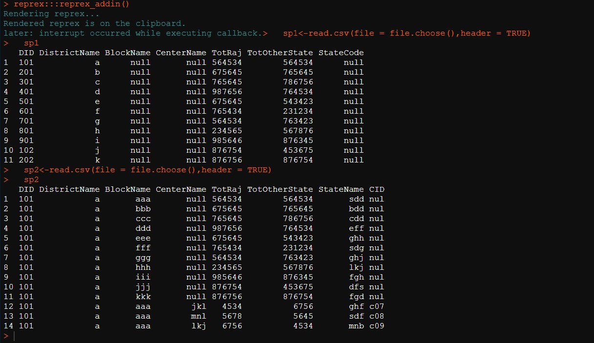
reprex for code is the following... and dummy data is given above and stored procedure 1 is saved as sp1 and stored procedure 2 is saved as sp2 in csv format
library(plotly)
#> Loading required package: ggplot2
#>
#> Attaching package: 'plotly'
#> The following object is masked from 'package:ggplot2':
#>
#> last_plot
#> The following object is masked from 'package:stats':
#>
#> filter
#> The following object is masked from 'package:graphics':
#>
#> layout
library(shiny)
library(dplyr)
#>
#> Attaching package: 'dplyr'
#> The following objects are masked from 'package:stats':
#>
#> filter, lag
#> The following objects are masked from 'package:base':
#>
#> intersect, setdiff, setequal, union
rm(list=ls())
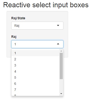
ui <-fluidPage(
titlePanel("Reactive select input boxes"),
sidebarPanel(
uiOutput("FirstChoice"),
uiOutput("SecondChoice")
),
mainPanel()
)
server = function(input, output) {
sp1<-read.csv(file = file.choose(),header = TRUE)
sp1
sp2<-read.csv(file = file.choose(),header = TRUE)
sp2
countyData = list("Raj"=c(sp1$DistrictName),"State"=c(sp2$StateName))
output$FirstChoice <- renderUI ({
selectInput(inputId = "FirstChoice",label = "Raj/State",
choices = c("Raj","State"))
})
output$SecondChoice <- renderUI ({
if (input$FirstChoice == "Raj"){lab <- "Raj"}
else if (input$FirstChoice == "State") {lab <- "State"}
else {lab <- "dependant"}
selectInput(inputId = "SecondChoice", label = lab,
choices = c(get(input$FirstChoice,countyData)))
})
}
shinyApp(ui = ui, server = server)
could anyone tell me why it is printing numbers instead of real value, i have tried a couple of methods like as.factor and as.character but didn't work for me, any sort of help would be great
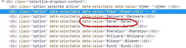
what i have tried... countyData = list("Raj"=as.list(paste(as.character(dtd$DistrictName))),"State"=as.list(paste(as.character(dtd$DistrictName)))),but when i click on any of these dropdown list value from select box it will render a chart as per specific id assigned to it,let's take scenario when district one is clicked it would plot a chart according to its id(101) from the database and so on, but when i checked the inspect element for that output what it is passing to database, it was just string values like district1 while i wanna show it as district1 but pass to DB as 101 to plot the chart specific to each scenario.
while i wanna display it like this exact way but wanna pass 101 for Alwar, 102 for Banswara and so on ,
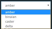
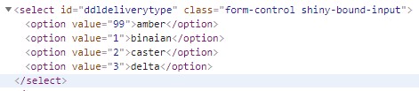
just to make it less confusing,i have given screenshots of relevant scenario ,as in the image we can notice ,it is passing 99 to database but print amber on ui that's how it looks like in ui that's how it is passed to ms SQL server i hope this will clear it up and explain what i am tryna achieve here
it was done using given below code but not can be applied to my case as i am using dynamic vector
instead of that ,what i am tryna doing is ... countyData = list("Raj"=as.list(paste(as.character(dtd$DistrictName))),"State"=as.list(paste(as.character(dtd1$StateName))))
I can't get your shiny reprex working because it refers to files on your computer. I'd simplify your question such that others can get it up and running quickly, and replicate the issue you're seeing.
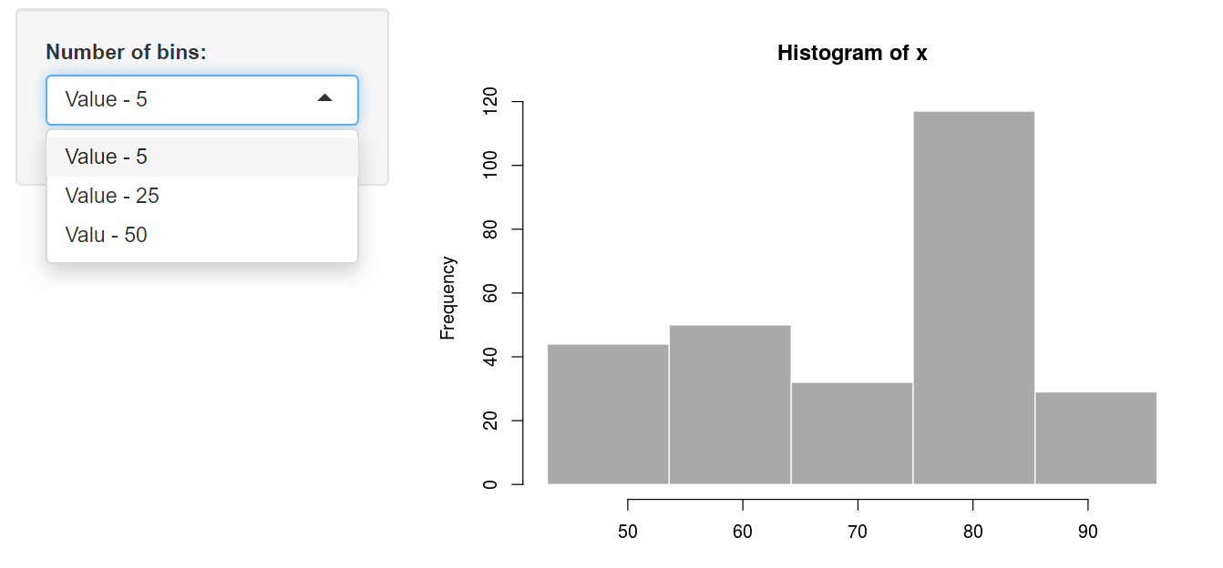
The values displayed in the dropdown are defined by the choices argument in the selectInput function.
As an example
#
# This is a Shiny web application. You can run the application by clicking
# the 'Run App' button above.
#
# Find out more about building applications with Shiny here:
#
#    http://shiny.rstudio.com/
#

Values = c(5,25,50)
names(Values) = c("Value - 5", "Value - 25", "Valu - 50")

library(shiny)

# Define UI for application that draws a histogram
ui <- fluidPage(

    # Application title
    titlePanel("Old Faithful Geyser Data"),

    # Sidebar with a slider input for number of bins
    sidebarLayout(
        sidebarPanel(
            selectInput("bins",
                        "Number of bins:",
                        choices = Values,
                        # choices = c("Value5" = 5,"Value25" = 25,"Value50" = 50)
            )

    ),

    # Show a plot of the generated distribution
    mainPanel(
        plotOutput("distPlot")
    )
)
)

# Define server logic required to draw a histogram
server <- function(input, output) {

    output$distPlot <- renderPlot({
        # generate bins based on input$bins from ui.R
        x    <- faithful[, 2]
        bins <- seq(min(x), max(x), length.out = as.numeric(input$bins) + 1)

        # draw the histogram with the specified number of bins
        hist(x, breaks = bins, col = 'darkgray', border = 'white')
    })
}

# Run the application
shinyApp(ui = ui, server = server)
thanks for your help i got what i was looking for ,your explanation fits my scenario best way possible,thanks for your help again even after i have provided half of the details earlier,i really appreciate your concern to this issue.