I am working with the R programming language.
I am trying to make a Contour Plot for the following function:
library(plotly)


  my_function <- function(x,y) {

    final_value = x^2 + y^2
    }


input_1 <- seq(-1.5, 1.5,0.1)
input_2 <- seq(-1.5, 1.5,0.1)


z <- outer(input_1, input_2, my_function)

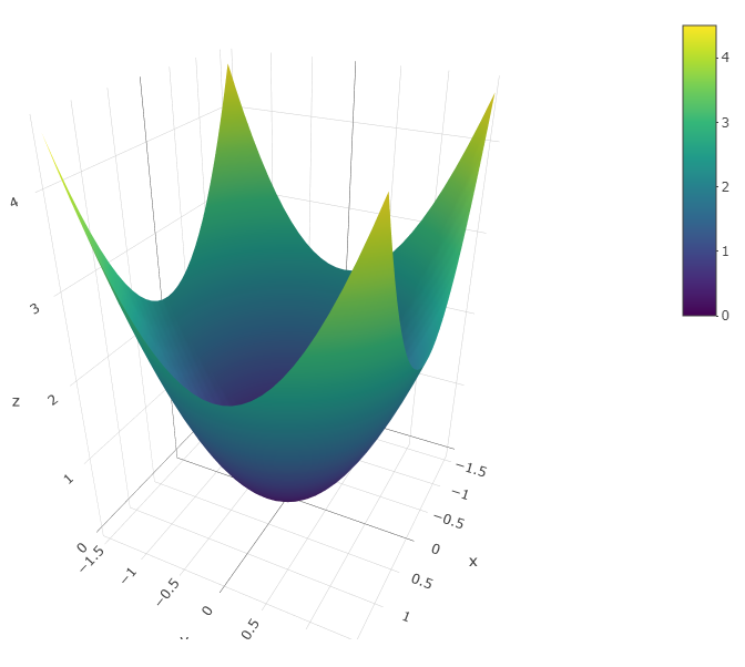
plot_ly(x = input_1, y = input_2, z = z) %>% add_surface()
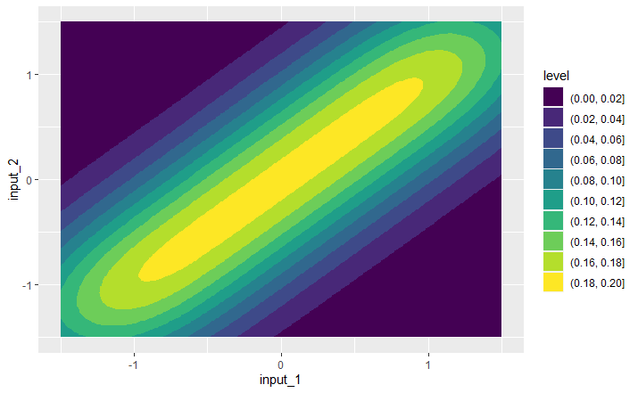
I am trying to follow the instructions from this link over here: 2D density contour plots in ggplot2 | R CHARTS. In this link, it shows how to make a contour plot for a data frame containing values for two different variables. In my case, it looks like I already have a matrix called "z". I tried to use the code from the website:
# install.packages("ggplot2")
library(ggplot2)

# Data
set.seed(1)

z = data.frame(z)

ggplot(z, aes(x = input_1, y = input_2)) +
  geom_density_2d_filled()
Can someone please tell me if what I have done is correct? Is this how Contour Plots (Level Plots) are made for functions using ggplot2?
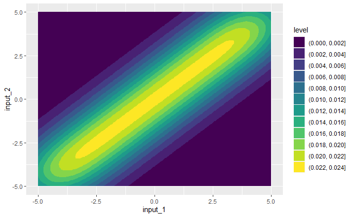
The reason I am skeptical is because I tried to repeat this process for a completely different function (Rastrigin function - Wikipedia) and got a very similar result:
 my_function <- function(x1, x2) {

    final_value = 20 + x1^2 + x2^2 - 10*(cos(2*pi*x1) + cos(2*pi*x2))
    }


x1 <- seq(-5, 5,0.1)
x2 <- seq(-5, 5,0.1)


z <- data.frame(outer(x1, x2, my_function))


ggplot(z, aes(x = x1, y = x2)) +
  geom_density_2d_filled()
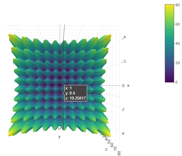
z <- outer(x1, x2, my_function)

plot_ly(x = x1, y = x2, z = z) %>% add_surface()
I don't think this is correct - both functions look entirely different and I doubt they would have the same contour plots. This makes me skeptical and think that I am doing something wrong.
Thanks!
Note: Ideally, the contour plot of the second function should look something like this: https://upload.wikimedia.org/wikipedia/commons/0/0e/Rastrigin-smooth-contour.svg


