Dear friends, I want to draw the heat map as shown below:
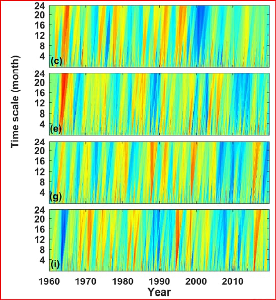
But the two pictures obtained by using the following code are not very suitable.
#load(example.data)
ggplot(example.data, aes( x=date, y=scales, fill=DI) ) +
geom_tile(width=100) +
scale_fill_continuous(type = "viridis")+
labs(title = 'Fig.1')
d <- dcast(example.data, date ~ scales )
d <- d[,-1]
image(x=unique(example.data$date),y=unique(example.data$scales),
z= as.matrix(d), col = heat.colors(81),
xlab='date',ylab='scales',main='Fig.2' )
The two figures obtained from the above code are as follows:
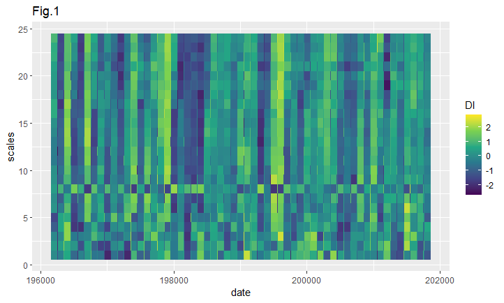
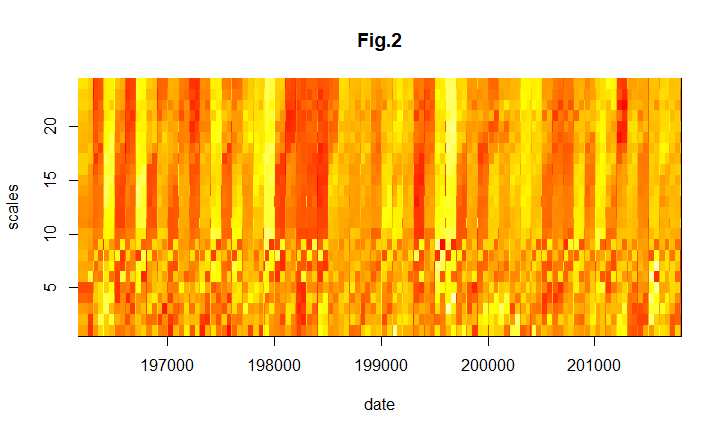
Please help me to find out what the problem is? Thank you very much!
Another question needs to be asked. How should I upload the data required by this code (the example.data is a data.table of 16152*3)?