Hello,
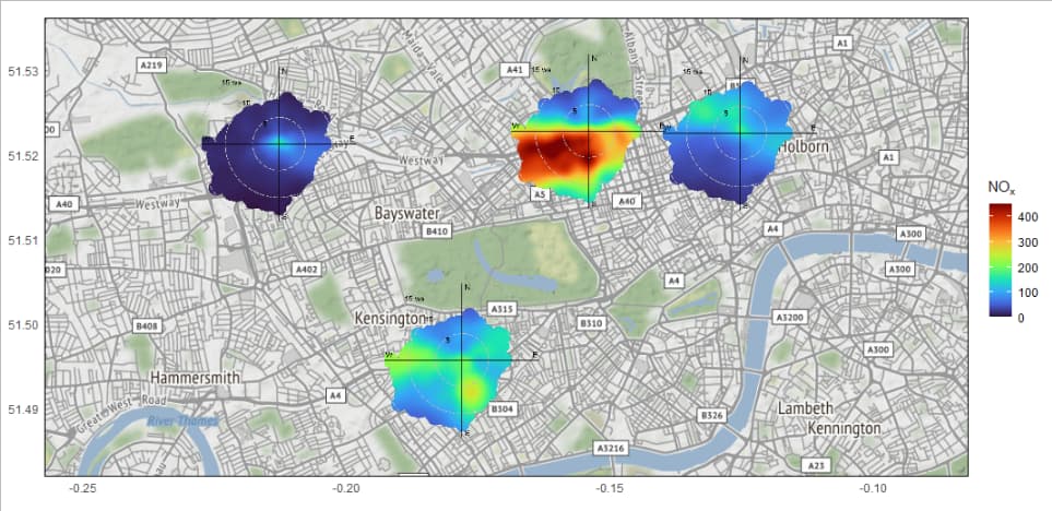
I am the lead developer of the {openairmaps} package, a package that (currently) creates dynamic air quality maps through extending the {openair} package. It effectively uses static polar plots as markers on an interactive map, and uses leaflet::addLegend() to draw a shared legend for all of them. {leaflet} allows you to draw any arbitrary legend just by providing a numeric scale and a colour palette to use - it is on you to make it match your data.
I'm questioning having static outputs also, which would be more useful for traditional reports. Adding a figure to a ggplot is easy enough with, e.g., {ggpath}, and I can add a basemap with {ggmap}, but I'm a bit lost on the shared legend.
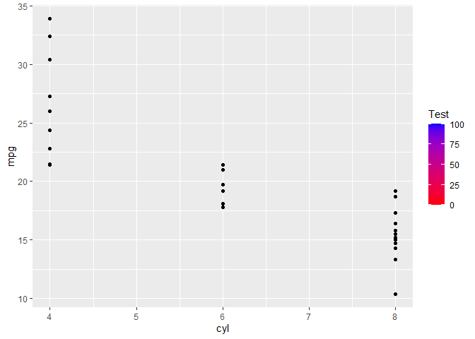
Is it possible to create a "dummy" colorbar legend that isn't associated with any aesthetic in the ggplot2 object itself?
A very simple example - what could I add to ggplot(mtcars, aes(cyl, mpg) + geom_point() to draw a colour bar that goes from zero to one-hundred, totally unrelated to mtcars, cyl and mpg?

