Connecting with other instructors using Tidyverse / r4ds book?

I'd love to have some forum to discuss with other instructors are teaching tidyverse, and particularly anyone using Garrett & Hadley's R4DS book in semester length courses. Is this a good Category for that thread?

For instance, I'm curious how and at what stage such instructors introduce technology such as GitHub & RMarkdown into a course. R4DS text is fascinating to me on many levels, but not least for presenting a comprehensive and compelling ordering for introducing a wide swath of material starting with relatively novice users. However, though it now has a unit on RMarkdown, but introduces this only at the end, and does not attempt to tackle the git / GitHub side of workflows. I've tended to start my students in Rmd notebooks on GitHub.

Would love to hear other ways in which instructors incorporate these materials and in what order they tackle them, and what there reasoning might be for one approach or another. (For instance, I've found the argument to start with visualization as the first thing, rather than, say, data types or control loops like a typical programming course, to be brilliant and very compelling). For reference, the undergraduate course I'm currently teaching around the R4DS text is here: https://espm-157.carlboettiger.info

Thanks!
10 Likes

Great topic @cboettig! I'm very interested in the discussion as well as I'm also using R4DS in my semester-long course. I think keeping the conversation under the tidyverse category with the teaching tag makes sense to me. Maybe separate posts for separate topics -- like RMarkdown or git or starting with visualization, etc.

As for starting with visualization -- that's totally my approach too. However I think I'm modifying it a bit next semester. I'm thinking: start with visualization and do that for a week, but then teach data wrangling for another week, then bring the two together for a couple weeks. The reason for this is that students often want to do things like create new variables when given an open ended data visualization problem, which requires introducing dplyr. So I found myself needing to introduce the mutate function in office hours, and I'd rather do that a bit more formally in class first.

1 Like

You might also be interested in https://dcl-2017-04.github.io/curriculum/upcoming.html, which is the course I've been remotely co-teaching with Bill Behrman at Stanford.

Compared to the book, we break the chapters up into much smaller pieces, and try and cycle back to each broad topic multiple times. When we teach it next, we'll probably break down the initial topics even more finely so students can get a super quick pass over all the major topics before going back for greater depth.

4 Likes

@mine Yes, I have basically the exact same problem -- need just a little dplyr, like mutate to make the visualization exercises compelling. Actually I often want to introduce a tidyr::gather too: e.g. I want them to get used to using ggplot as a map of aesthetics to columns, so when plotting two lines of different colors on the same plot, I'd prefer they gather those columns first so they have a y-axis column and a color column, rather than 2 y-axis columns. Maybe that's pedantic though? My course is oriented around ~ 5 'real-world problem' modules, so we need a bit of visualization and a bit of manipulation etc in each unit. (Also a good bit of readr functions/arguments because I've decided to start with actual NOAA data rather than data I have pre-cleaned... maybe an unwise choice but it does make the point!)

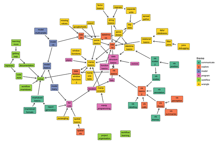
Wow, @hadley, that table is awesome. Getting the right interleaving of the different elements (vis, wrangle, problem, model, communicate) is exactly what I was trying to say. I should definitely steal that idea and try and make a similar map for how I'm trying to lay out material. Also very interested in your spatial chapter, I've just started adding (an sf-based) spatial module to my (so far largely time-series-focused) modules on global change ecology.

I should also mention that all the sources are on github: GitHub - dcl-2017-04/curriculum: Curriculum for Data Challenge Lab (2017-04). It includes this overview graph that I'm rather proud of:

14 Likes

I've been doing a half-semester course using parts of R4DS (it's at https://dataviz.andrewheiss.com/schedule/) and I ended up making students do homework and projects in R Markdown, but I also do not have them touch Git, since it's such a short class (and most students have no technical background). The core of the class is data visualization, not necessarily R or statistics, so I've focused entirely on ggplot and just enough dplyr/tidyr to get data manipulated and in the right shape.

It's been a rough first couple weeks getting everyone familiar with how to insert chunks, knit stuff, etc.—we had to spend a good portion of one class going over what Markdown is—but jumping straight into making figures has gotten them pretty excited (and they've caught on to ggplot syntax already). I'm hoping that the rest of the semester goes more smoothly now that they have the fundamentals of knitting, ggplot, and dplyr.

2 Likes

Interesting topic Carl, one I'm very much interested in too. I'm currently in the early stages of developing, for want of a better term, a practical data science for applied scientists course, so I'm both thinking about these issues and gobbling up ideas and experiences from others who have done similar things.

Looking at your course that you mention, we have probably the same kind of student in mind. I'd been juggling with the idea of introducing RMarkdown & reproducibility etc relatively early on (after some intro data vis, data I/O, simple data manipulations). This leaves a gap in the first few weeks if I want students to do their work in Rmd documents. One option I am toying with is to base some of the early assigned work on tutorial webpages built using learnr. That way the students get to learn and use R and gain some basic familiarity with the bits of R we cover up front. Then once we've covered Rmd and how to work with these in RStudio I can set that expectation for future assignments or assessed work.

I haven't yet decided on whether to teach git or not; it would pain me considerably to not cover it, but it is also quite technical for the sorts of skill levels we get in classes in Biology at my institution. If I include it, it will be towards the end and not something that I use as part of a workflow for the course, as some courses do.

1 Like

Yes STAT 545 also does a cyclical thing. Basic vis, basic wrangle, intermediate vis, intermediate wrangle (... programming aspects of R) with increasing sophistication when we visit a topic the 2nd time.

6 Likes

I co-taught a course in data stewardship last year targeted at graduate students in agronomy, most of which had never coded before. We started with Rmarkdown because it is generally a very good first coding experience. If a student makes a mistake, they will not get what they want, but they will probably not get a frustrating error.

We also started early with GitHub because all assignments and projects needed to be submitted via GitHub. We used SourceTree because almost none of our students even knew what the command line is (and I certainly don't use it). If I did it again, I would teach Git through RStudio. I think RStudio has improved on this and I feel like SourceTree gets worse with each update.

Getting into R, we were really torn on what order we should teach things in. Visualization first, Tidyverse first has a lot of good arguments, but were nervous to do this for people who were still wondering, "What even is R?". R4DS was mostly available, but not quite done at this time. I think that, selfishly, we wanted students to have enough base R background to truly appreciate what the Tidyverse was doing for them, although we never really put them through the ringer. We also thought they would probably encounter and work with some base R, so better to do it with us than in the wild. It seemed like the order worked well while we were doing it. The course was not required for any of the students, so we had a mostly willing audience.

Overall, however, I'm not sure I can say the course was a success. We had 15 students, many of whom I still work with on various projects. The few who already used R continue to do so in their own fashion. Those who had not used it, do not use it now. One person uses Rmarkdown. Zero of 15 people continued to use GitHub after the course (yes, I stalked their profiles).

You can find our course materials here: http://agron590-isu.github.io/syllabus.html. The spring following our course, there was a similarly-minded course taught in the Stats department and I think it may have done a better job of a lot of things - https://stat585-at-isu.github.io/syllabus.html. I feel it was targeted at a very different audience, I'm not sure which yours is more similar to.

Hope this is helpful. I'm late to this thread, but considering whether I should teach Data Stewardship again in the spring and what changes I would make. I may teach straight out of R4DS.

6 Likes

hey @cboettig - I am also using R4DS in my intro-level statistics course for social science students, though there are big chunks that I am skipping. I introduce Git/GitHub on the first week and circle back to it on week three of the semester when students are ready to submit their first assignments. We walk through the process of cloning / committing / pushing their first assignments to their individual assignment repos at the beginning of that class (the course only meets once per week).

In between, I introduce ggplot2, dplyr, and RMarkdown on week 02. All assignments are submitted as Rmd Notebooks along with their HTML output. I only introduce a few plots (histograms, bar plots, line plots) at the outset, and only a couple of the dplyr verbs. I circle back to them routinely throughout the semester to add complexity.

Here is my course GitHub organization - https://github.com/slu-soc5050

Would love to hear how other folks are using these skills in their classrooms!

3 Likes

I am teaching a two-semester course and using the r4ds book as the main text. I started with R Markdown and have the students do all their assignments and exams in that format. So, after the R markdown chapter, I did an overview of R programming (data entry, assignment and indexing, basic control structures), then started back with the ggplot2 chapter and just finished dplyr chapter.

2 Likes

Next semester I am going to teach a 1-credit graduate level course where we will literally just go through R4DS together, flipped classroom style, meeting only once a week. I'm hoping to give non-programmers a soft start into R so they will feel less intimidated taking other courses on campus (e.g. taught in stats department).

I'm having a tough time coming up with a name and think it would be most appropriate to call it "R for Data Science". @hadley would that be okay? Or, "Intro to R for Data Science", but I don't want to imply the book is not comprehensive.

4 Likes

I think "R for data science" is a great name :slight_smile:

3 Likes

Ranae,

From your description it sounds like we have similar goals- part of my job is providing training to staff and student groups at an institution so they can go on work more productively in their own areas.

One of the things that works well for me is strongly emphasising not so much the how of particular examples, but the general case metaphors and context of why one does particular steps (as often people new to R are not good at generalising what they are learning).

In particular, I would heartily recommend the metaphor of the kitchen sausage machine or spice grinder to people new to functions to get them started. The parentheses are the funnel at the top, you feed in the ingredients, the machine makes a sausage that comes out the side, if you feed in different ingredients you get a slightly different flavour of sausage.

read.csv("example.csv")

sausage spills all over the tabletop, so we want to catch it in a labelled box
example <- read.csv("example.csv")

then we check the data with str() having a discussion about how the kind of data you have determines the kind of questions you can ask (and raise factors vs characters), then go back to the earlier command and change it to
example <- read.csv("example.csv", stringsAsFactors = FALSE)
and check str() again to show changes (and show the way writing down commands means you can repeat things).

2 Likes

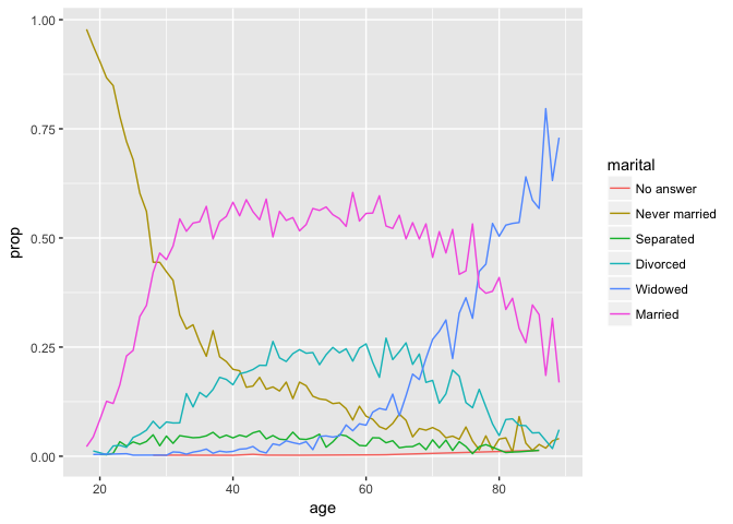
Has anybody else tried the example from the forcats section to plot marital status by age and run into incorrect results? I am probably doing something stupid, but I swear I copied the code exactly from the book. Seems my mutate is giving incorrect results..... any help would be appreciated.

by_age <- gss_cat %>%
+   filter(!is.na(age)) %>%
+   group_by(age, marital) %>%
+   count() %>%
+   mutate(prop = n / sum(n))
> 
> ggplot(by_age, aes(age, prop, colour = marital)) +
+   geom_line(na.rm = TRUE)
> 
> by_age
# A tibble: 351 x 4
# Groups:   age, marital [351]
     age       marital     n  prop
   <int>        <fctr> <int> <dbl>
 1    18 Never married    89     1
 2    18       Married     2     1
 3    19 Never married   234     1
 4    19      Divorced     3     1
 5    19       Widowed     1     1
 6    19       Married    11     1
 7    20 Never married   227     1
 8    20     Separated     1     1
 9    20      Divorced     2     1
10    20       Married    21     1
# ... with 341 more rows

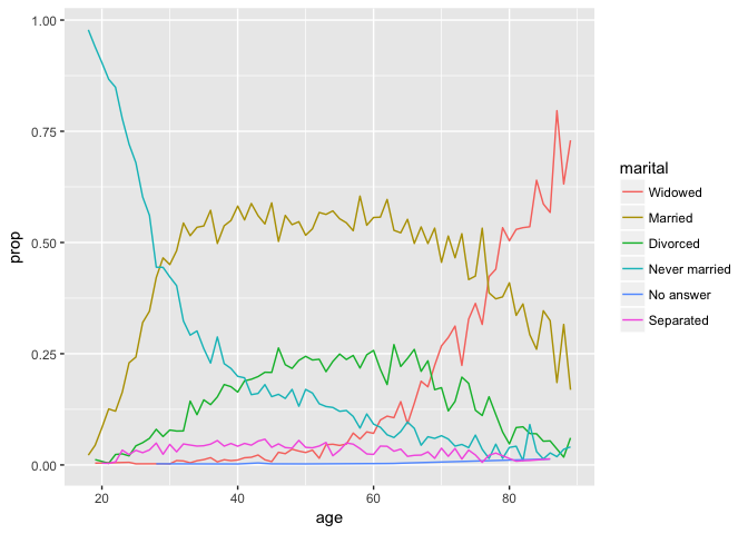
I'm not sure if something has changed with the way count() handles grouping, but the problem in the code is that mutate(prop = n / sum(n)) is performed on a tibble grouped by age and marital status. It is calculating the proportion by age and by marital status, so the proportion is always 1. It looks like we should calculate the proportion of marital status grouped only by age to replicate the graphs.

Here's a slight modification that gets it done:

library(tidyverse)

by_age <- gss_cat %>%
  filter(!is.na(age)) %>%
  count(age, marital) %>% # count by both age and marital status
  group_by(age) %>% # only group by age to calc proportion
  mutate(prop = n / sum(n))
by_age
#> # A tibble: 351 x 4
#> # Groups:   age [72]
#>      age       marital     n        prop
#>    <int>        <fctr> <int>       <dbl>
#>  1    18 Never married    89 0.978021978
#>  2    18       Married     2 0.021978022
#>  3    19 Never married   234 0.939759036
#>  4    19      Divorced     3 0.012048193
#>  5    19       Widowed     1 0.004016064
#>  6    19       Married    11 0.044176707
#>  7    20 Never married   227 0.904382470
#>  8    20     Separated     1 0.003984064
#>  9    20      Divorced     2 0.007968127
#> 10    20       Married    21 0.083665339
#> # ... with 341 more rows

ggplot(by_age, aes(age, prop, colour = marital)) +
  geom_line(na.rm = TRUE)

ggplot(by_age, aes(age, prop, colour = fct_reorder2(marital, age, prop))) +
  geom_line() +
  labs(colour = "marital")

UPDATE: added PR to r4ds repo.

4 Likes

using r4ds in my uchicago harris course this coming winter quarter. following!