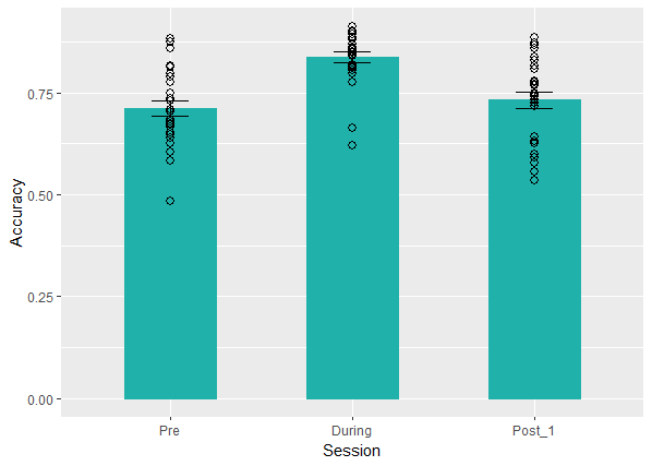
How can I connect with lines the dots over the first bar with the dots over the second bar and the dots of the second bar with the dots of the third bar.
Each dot represent a single subject in a repeated measure design experiment.
For the barplot and the scatterplot the data came from different dataset.
std.error <- function(x) sd(x)/sqrt(length(x))


  session_order <- c("Pre", "During", "Post_1")
  ggplot() +
    geom_bar(data = my_data_isolation_ordered[my_data_isolation_ordered$Manipulation=="Attended Visual Field" & my_data_isolation_ordered$Stimulation=="Sham",],
             aes(x = Session, y = Accuracy),
             color = "#20B2AA", fill = "#20B2AA", stat = "summary", width = 0.5) +
    geom_errorbar(data = my_data_isolation_ordered[my_data_isolation_ordered$Manipulation=="Attended Visual Field" & my_data_isolation_ordered$Stimulation=="Sham",],
                  aes(x = Session, y = Accuracy, ymin = mean(Accuracy) - std.error(Accuracy), ymax = mean(Accuracy) + std.error(Accuracy)),
                  color = "black", width = 0.2) +
    geom_point(data = my_data_isolation_ordered[my_data_isolation_ordered$Manipulation=="Attended Visual Field" & my_data_isolation_ordered$Stimulation=="Sham",],
               aes(x = Session, y = Accuracy),
               alpha = 1.5, shape = 21, size = 2.5, color = "black") +
    geom_bar(data = my_data_sham[my_data_sham$Session == "Pre" & my_data_sham$Manipulation == "Attended Visual Field",],
             aes(x = Session, y = Accuracy),
             color = "#20B2AA", fill = "#20B2AA", stat = "summary", width = 0.5) +
    geom_errorbar(data = my_data_sham[my_data_sham$Session == "Pre" & my_data_sham$Manipulation == "Attended Visual Field",],
                  aes(x = Session, y = Accuracy, ymin = mean(Accuracy) - std.error(Accuracy), ymax = mean(Accuracy) + std.error(Accuracy)),
                  color = "black", width = 0.2) +
    geom_point(data = my_data_sham[my_data_sham$Session == "Pre" & my_data_sham$Manipulation == "Attended Visual Field",],
               aes(x = Session, y = Accuracy),
               alpha = 1.5, shape = 21, size = 2.5, color = "black") +
    geom_bar(data = my_data_sham[my_data_sham$Session == "Post_1" & my_data_sham$Manipulation == "Attended Visual Field",],
             aes(x = Session, y = Accuracy),
             color = "#20B2AA", fill = "#20B2AA", stat = "summary", width = 0.5) +
    geom_errorbar(data = my_data_sham[my_data_sham$Session == "Post_1" & my_data_sham$Manipulation == "Attended Visual Field",],
                  aes(x = Session, y = Accuracy, ymin = mean(Accuracy) - std.error(Accuracy), ymax = mean(Accuracy) + std.error(Accuracy)),
                  color = "black", width = 0.2) +
    geom_point(data = my_data_sham[my_data_sham$Session == "Post_1" & my_data_sham$Manipulation == "Attended Visual Field",],
               aes(x = Session, y = Accuracy),
               alpha = 1.5, shape = 21, size = 2.5, color = "black") +
    scale_x_discrete(limits = session_order)
Also, is there a best way to do it?