Is this what you're after? I have created a sample dataset.
library(tidyverse)
# sample data
ff <- tibble(srh = sample(1:3, 15, replace = TRUE),
year = sample(2017:2020, 15, replace = TRUE),
sex = sample(1:2, 15, replace = TRUE)) %>%
mutate(sex = factor(sex))
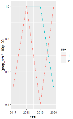
ff %>%
select(srh, year, sex) %>%
filter(!is.na(srh),
!is.na(sex)) %>%
group_by(year, sex) %>%
summarise(prop_srh = sum(srh > 1, na.rm = TRUE) / n()) %>%
ggplot(aes(x = year, y = (prop_srh * 100)/100, colour = sex)) +
geom_line()
Next time, please provide a reproducible example, e.g. for ff .