Combined line plot for proportions

Hi,
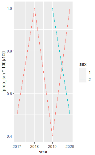
I am trying to make a line plot that shows the overall proportion of srh scores >1, and that for male and female sex separately as well. So, there will be three lines for each year point, overall, male, and female. I could make the plot for overall and for the two sexes, but I am not being able to combine them in the same plot.
I'd greatly appreciate if you could give me an idea about it. Below are the data and the codes:

ff %>% select(srh, year, sex)%>% filter(!is.na(srh)) %>% 
    filter(!is.na(sex)) %>% 
    group_by(year) %>%   # Group by year only
    summarize(prop_srh = sum(srh > 1, na.rm = TRUE) / n()) %>% 
    ggplot(aes(x = year, y = (prop_srh * 100)/100)) +
    geom_line(color = "black") 

   srh year sex
1    3 2017   2
2    2 2018   2
3    2 2018   2
4    3 2018   1
5    1 2017   2
6    3 2019   1
7    2 2022   1
8    2 2018   2
9    2 2018   1
10   3 2017   2
11   2 2018   1
12   3 2018   2
13   3 2020   2
14   3 2018   2
15   2 2020   2

Is this what you're after? I have created a sample dataset.

library(tidyverse)

# sample data
ff <- tibble(srh = sample(1:3, 15, replace = TRUE),
             year = sample(2017:2020, 15, replace = TRUE),
             sex = sample(1:2, 15, replace = TRUE)) %>% 
  mutate(sex = factor(sex))

ff %>% 
  select(srh, year, sex) %>% 
  filter(!is.na(srh),
         !is.na(sex)) %>% 
  group_by(year, sex) %>%   
  summarise(prop_srh = sum(srh > 1, na.rm = TRUE) / n()) %>% 
  ggplot(aes(x = year, y = (prop_srh * 100)/100, colour = sex)) +
  geom_line() 

Next time, please provide a reproducible example, e.g. for ff .

Hi williaml,

Thanks so much for the detailed response. The chart is almost ok, I just want to add another line for the overall/combined trend of srh to understand who is better off between men and women. Please let know if you have any ideas about this.

Thanks!

How about something like this?

library(tidyverse)

# sample data
ff <- tibble(srh = sample(1:3, 15, replace = TRUE),
             year = sample(2017:2020, 15, replace = TRUE),
             sex = sample(1:2, 15, replace = TRUE)) %>% 
  mutate(sex = factor(sex)) %>%
  # assuming that there are more columns in your original data and that there are NAs
  select(srh, year, sex) %>% 
  filter(!is.na(srh),
         !is.na(sex)) 

# by sex
ff1 <- ff %>% 
  group_by(year, sex) %>%   
  summarise(prop_srh = sum(srh > 1, na.rm = TRUE) / n())

# total
ff2 <- ff %>% 
  group_by(year) %>%   
  summarise(prop_srh = sum(srh > 1, na.rm = TRUE) / n()) %>% 
  mutate(sex = "Total")

# combined
ff3 <- bind_rows(ff1, ff2)

# the graph
ggplot(ff3, aes(x = year, y = (prop_srh * 100)/100, colour = sex)) +
  geom_line() 

This topic was automatically closed 21 days after the last reply. New replies are no longer allowed.

If you have a query related to it or one of the replies, start a new topic and refer back with a link.