aulis
1
How can I add two identical (but with different data_base) ggplot into one graphic?
See the code for the plots below:
PLOT1:
ggplot(ipw_monthly_out2, aes(x = month, y = effect)) +
geom_line() +
geom_point(aes(x = month, y = sig), shape = 18, size = 3) +
geom_ribbon(aes(ymin = cil, ymax = cih), alpha=0.3) +
theme_bw(base_size = 20) +
xlab("Months after program start") +
ylab("Effect on exit rate highedu (IPW)") +
geom_hline(yintercept = 0, linetype="dashed")
PLOT2:
ggplot(ipw_monthly_out2_l, aes(x = month, y = effect)) +
geom_line() +
geom_point(aes(x = month, y = sig), shape = 18, size = 3) +
geom_ribbon(aes(ymin = cil, ymax = cih), alpha=0.3) +
theme_bw(base_size = 20) +
xlab("Months after program start") +
ylab("Effect on exit rate highedu (IPW)") +
geom_hline(yintercept = 0, linetype="dashed")
Please, can somebody help, I have tried for hours:(
FJCC
2
Here are two possible solutions, depending on what you meant by "one graphic". Since I do not have your data, I could not test the code.
#Two lines on one plot
ggplot(mapping = aes(x = month)) +
  geom_line(aes(y = effect), data = ipw_monthly_out2) +
  geom_point(aes(y = sig), shape = 18, size = 3, data = ipw_monthly_out2) +
  geom_ribbon(aes(ymin = cil, ymax = cih), alpha=0.3, dta = ipw_monthly_out2) +
  geom_line(aes(y = effect), data = ipw_monthly_out2_l) +
  geom_point(aes(y = sig), shape = 18, size = 3, data = ipw_monthly_out2_l) +
  geom_ribbon(aes(ymin = cil, ymax = cih), alpha=0.3, dta = ipw_monthly_out2_l) +
  theme_bw(base_size = 20) +
  xlab("Months after program start") +
  ylab("Effect on exit rate highedu (IPW)") +
  geom_hline(yintercept = 0, linetype="dashed")

#facet plot
ipw_monthly_out2$Data_Set <- "1"
ipw_monthly_out2_l$Data_Set <- "2"

ggplot(ipw_monthly_out2, aes(x = month, y = effect)) +
geom_line() +
geom_point(aes(x = month, y = sig), shape = 18, size = 3) +
geom_ribbon(aes(ymin = cil, ymax = cih), alpha=0.3) +
facet_wrap(~Data_Set) +
theme_bw(base_size = 20) +
xlab("Months after program start") +
ylab("Effect on exit rate highedu (IPW)") +
geom_hline(yintercept = 0, linetype="dashed")
1 Like
Maybe ggarrange is what you are looking for: Arrange Multiple ggplots — ggarrange • ggpubr
1 Like
amare
4
@aulis ,
Just put plot1 and plot in the cowplot function called plot_grid
library(cowplot)
cowplot::plot_grid(plo1,plot2)
or just simply
plot1 + plot2
best,
Amare
1 Like
aulis
5
thank you, your solution worked!!
But now I'm struggling with getting a legend in, may you can help me again? I hate plots so much!
Code now, with booth plots:
ggplot(mapping = aes(x = month)) +
geom_line(aes(y = effect), data = ipw_monthly_out2, color='blue') +
geom_point(aes(y = sig), shape = 18, size = 3, data = ipw_monthly_out2, color='blue') +
geom_ribbon(aes(ymin = ipw_monthly_out2$cil, ymax = ipw_monthly_out2$cih), alpha=0.3, dta = ipw_monthly_out2) +
geom_line(aes(y = effect), data = ipw_monthly_out2_l, color='red') +
geom_point(aes(y = sig), shape = 18, size = 3, data = ipw_monthly_out2_l, color='red') +
geom_ribbon(aes(ymin = ipw_monthly_out2_l$cil, ymax = ipw_monthly_out2_l$cih), alpha=0.3, dta = ipw_monthly_out2_l) +
theme_bw(base_size = 20) +
xlab("Months after program start") +
ylab("ATET on exit rate (IPW)") +
geom_hline(yintercept = 0, linetype="dashed")
FJCC
6
Here are two simplified examples of manually setting colors and generating a legend.
library(ggplot2)

DF <- data.frame(X=1:4,Y=2:5)
DF2 <- data.frame(X=1.5:4.5,Y=3)
ggplot(mapping=aes(X,Y))+
  geom_line(aes(color="First"),data=DF)+
  geom_line(aes(color="Second"),data=DF2)+
  scale_color_manual(values = c(First="blue",Second="red"))+
  labs(color="Source")
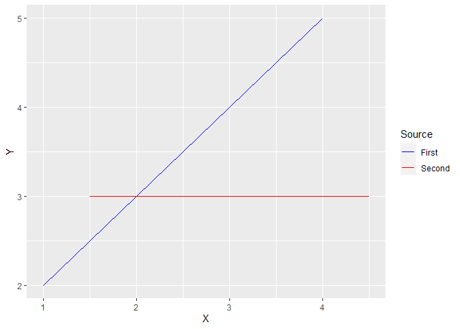
DF$Source <- "First"
DF2$Source <- "Second"
AllDat <- rbind(DF,DF2)

ggplot(AllDat,aes(X,Y))+
  geom_line(aes(color=Source))+
  scale_color_manual(values = c(First="blue",Second="red"))
Created on 2022-10-23 with reprex v2.0.2
aulis
7
Perfect, thank you so much!
system
Closed
8
This topic was automatically closed 7 days after the last reply. New replies are no longer allowed.
If you have a query related to it or one of the replies, start a new topic and refer back with a link.