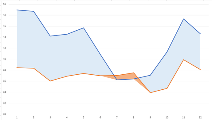
I want to create a graph with 2 curves (MG & MP), and when MP > MG, colour the area between the 2 curves in red.
Here is an example with Excel done with this video https://www.youtube.com/watch?v=83o3e_E1j5c&ab_channel=Learnaccess
I have a dataframe with 4 columns: the X series (month), the 2 series for the curves, and the calculated series (MP-MG)
   mois     M.G.  M.P. inv_taux
   <chr>   <dbl> <dbl>    <dbl>
 1 2020-12  33.7  34.5    0.740
 2 2021-01  34.8  35.4    0.540
 3 2021-02  34.3  35.1    0.860
 4 2021-03  34.8  35.2    0.340
 5 2021-04  33.7  35.0    1.36
 6 2021-05  32.6  33.9    1.27
 7 2021-06  30.6  32.9    2.30
 8 2021-07  30.9  33.3    2.43
 9 2021-08  29.5  32.5    2.97
10 2021-09  31.5  33.8    2.27
11 2021-10  33    34.4    1.37
12 2021-11  32.8  34.3    1.5
and here is the beginning of the code for my graph
hc<-highchart()%>%
  hc_add_series(data = df, hcaes(x=df$mois, y=df$inv_taux), type='area', stack='normal')%>%
  hc_add_series(data = df, hcaes(x=df$mois, y=df$M.G.), type='line')%>%
  hc_add_series(data = df, hcaes(x=df$mois, y=df$M.P.), type = 'line')
  hc_yAxis(min=0)
Thank you for your help !
