Coloring different portions of a line graph in GGplot

Hi, I am working on making a graph of spawning stock biomass for spiny dogfish over time. Throughout my timeline, quotas have changed and I wanted to indicate those years along the line graph by changing colors of portions of the graph. So far, I just added a column with the quota status and had it set by color, but it gives me a broken up graph. I was wondering if someone knew of a way to join all the pieces, or if there was an alternate way to do this whole thing.

Thanks in advance for any advice!

YEAR AVERAGE FEMALE SSB QUOTA STATUS
1982 275.1 None
1983 266.1 None
1984 215.8 None
1985 170.1 None
1986 208 None
1987 242.5 None
1988 281.2 None
1989 271.5 None
1990 331.8 None
1991 260.9 None
1992 300.4 None
1993 245.2 None
1994 206.8 None
1995 147.5 None
1996 134.7 None
1997 127.5 None
1998 102.3 None
1999 57.7 None
2000 58.4 Coastwide
2001 68.4 Coastwide
2002 72.5 Coastwide
2003 65.5 Regional
2004 60 Regional
2005 53.6 Regional
2006 116.6 Regional
2007 155.8 Regional
2008 217.7 State
2009 182.7 State
2010 183.5 State
2011 174.2 State
2012 241.5 State
2013 235.9 State
2014 NA State
2015 133.8 State
2016 154.4 State
2017 111.1 State
2018 102.4 State
2019 82.7 State

ggplot(SSB) + (aes(x = YEAR, y = AVERAGE.FEMALE.SSB, color = QUOTA.STATUS )) + geom_line()
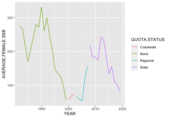
Rplot

Drop the missing values (NA) and use the group aesthetic, see this example

library(tidyverse)

SSB <- data.frame(
    stringsAsFactors = FALSE,
                YEAR = c(1982,1983,1984,1985,
                         1986,1987,1988,1989,1990,1991,1992,1993,1994,1995,
                         1996,1997,1998,1999,2000,2001,2002,2003,2004,
                         2005,2006,2007,2008,2009,2010,2011,2012,2013,
                         2014,2015,2016,2017,2018,2019),
  AVERAGE.FEMALE.SSB = c(275.1,266.1,215.8,170.1,
                         208,242.5,281.2,271.5,331.8,260.9,300.4,245.2,
                         206.8,147.5,134.7,127.5,102.3,57.7,58.4,68.4,
                         72.5,65.5,60,53.6,116.6,155.8,217.7,182.7,183.5,
                         174.2,241.5,235.9,NA,133.8,154.4,111.1,102.4,
                         82.7),
        QUOTA.STATUS = c("None","None","None",
                         "None","None","None","None","None","None","None",
                         "None","None","None","None","None","None","None",
                         "None","Coastwide","Coastwide","Coastwide",
                         "Regional","Regional","Regional","Regional","Regional",
                         "State","State","State","State","State","State",
                         "State","State","State","State","State","State")
)

SSB %>% 
    drop_na(AVERAGE.FEMALE.SSB) %>% 
    ggplot(aes(x = YEAR, y = AVERAGE.FEMALE.SSB, color = QUOTA.STATUS, group = 1)) +
    geom_line()

Created on 2020-11-14 by the reprex package (v0.3.0.9001)

NOTE: Please notice the way I'm sharing the sample data, next time try to provide a proper REPRoducible EXample (reprex) illustrating your issue.

Thank you for the help! I didn't think of using the group aesthetic. I'll also make sure to format the data properly next time, I'm still very new at all of this.

If your question's been answered (even by you!), would you mind choosing a solution? It helps other people see which questions still need help, or find solutions if they have similar problems. Here’s how to do it:

I will do that now, thanks for letting me know!

This topic was automatically closed 7 days after the last reply. New replies are no longer allowed.

If you have a query related to it or one of the replies, start a new topic and refer back with a link.