Hi All,
xp = seq(0, 5, length = 100)
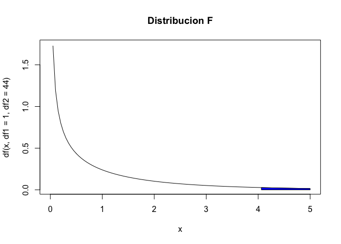
All is ok in this code. But I would like to mark the rejection zone in color blue.
Could you help me with this, please?.
Is this what you want?
xp = seq(0, 5, length = 100)
y=df(x=xp,df1=1,df2=44)
curve(df(x, df1=1, df2=44), from=0, to=5, main="Distribucion F")
F.critico=4.061
polygon(c(F.critico, F.critico, xp[xp>F.critico], max(xp)),
        c(0, df(F.critico, df1=1, df2=44), y[xp>F.critico], 0),
        col = "blue")
Created on 2020-12-06 by the reprex package (v0.3.0)
If this is right, the change is for your polygon you only need to specify the x values which fall in critical region.
Yes Yarnavrina.
system
December 13, 2020, 3:31pm
4
This topic was automatically closed 7 days after the last reply. New replies are no longer allowed.

