Hi all,
I am trying to create a clustered graph (not a stacked graph) in R where I will compare
Sedentary Minutes and Active Minutes by week. I have found some solutions however I don't want to create a clustered graph by, say Category (e.g. male vs female). I want to create a graph just comparing the 2 columns values by week. Do you know how can I create that graph?
Many thanks in advance.
Kind regards,
Panos
Hi @Panagiotis_Emmanouil
You didn't provide any of your data so we can only guess what is looks like, however, this code produces a clustered bar chart that may get you started:
suppressPackageStartupMessages(library(tidyverse))
set.seed(42)

# Create some dummy data
dat <- data.frame(week = rep(1:10, each=2),
                  gender = rep(c("female", "male"), times=10),
                  sedentary = c(sample(100:250, size=20)),
                  active = c(sample(50:100, size=20)))
dat
#>    week gender sedentary active
#> 1     1 female       148     85
#> 2     1   male       164     86
#> 3     2 female       173     80
#> 4     2   male       245     94
#> 5     3 female       221     54
#> 6     3   male       250     69
#> 7     4 female       227     83
#> 8     4   male       146     77
#> 9     5 female       123     89
#> 10    5   male       170     52
#> 11    6 female       199     82
#> 12    6   male       188     73
#> 13    7 female       209     79
#> 14    7   male       119     64
#> 15    8 female       213     71
#> 16    8   male       210     57
#> 17    9 female       230     53
#> 18    9   male       140     99
#> 19   10 female       239     67
#> 20   10   male       126     62

# Convert to "long" format
pivot_longer(dat, cols=3:4, names_to="type", values_to="minutes") -> long.dat

# Summarise the data across "gender" and then plot the total minutes
long.dat %>%
  group_by(week, type) %>%
  summarise(total_mins = sum(minutes)) %>%
  ggplot(.) +
    aes(x=as.factor(week), y=total_mins) +
    geom_col(aes(fill = type), position = position_dodge2(width=0.5, padding=0.2)) +
    xlab("Week Number") +
    ylab("Total Minutes")
#> `summarise()` has grouped output by 'week'. You can override using the
#> `.groups` argument.
Created on 2023-06-15 with reprex v2.0.2
Thank you DavoWW!
unfortunately I don't have male female column. I have the following 3 columns that I want to summarise :
Date, Sedentary Minutes, Active Minutes
I am afraid that there is not the solution that i wish and only your solution works (if a column , say male-female, existed).
Thanks
Panos
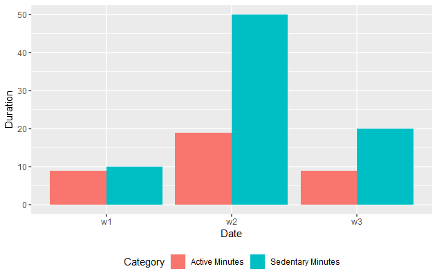
library(tidyverse)
(example_data <- tibble(Date = c("w1","w2","w3"),
`Sedentary Minutes`=c(10,50,20),
`Active Minutes` = c(9,19,9)))

(ex_d2 <- pivot_longer(example_data,
                      cols = -Date,
                      names_to = "Category",
                      values_to = "Duration"))

ggplot(data=ex_d2) +
  aes(x=Date,
      y=Duration,
      fill=Category) +
  geom_col(position = "dodge") +
  theme(legend.position = "bottom")
1 Like
Well done nirgahamuk! It looks great! What I was looking for the last 3 days. I will check tonight
Hi nirgrahamuk,
if you wanted to create a clustered column by week but comparing median vs average sedentary minutes (group_by Id) how would you do it? I have now 4 columns(+Id) and the above solution it doesn't work.
Any tip?
Thanks
Panos
to increase the categorisation heirarchy , use either facet_wrap or facet_grid ;
if you would like particular support, please provide a reprex.
daily_activity<- read.csv("dailyActivity_merged.csv")
ActiveDistanceMedianandAverage<- daily_activity%>%
select(Id ,ActivityDate,ActiveLifestyleDistance)
ActiveDistanceMedianandAverage<- ActiveDistanceMedianandAverage%>%
mutate(ActiveLifestyleDistanceAvg=mean(ActiveLifestyleDistance),
ActiveLifestyleDistanceMedian=median(ActiveLifestyleDistance) )%>%
group_by(Id)
I would like to get a graph like the above that you generated but I want to have median vs average ActiveLifestyleDistance by week. facet_wrap() function is the best option?
Thanks for providing code. Could you kindly take further steps to make it easier for other forum users to help you? Share some representative data that will enable your code to run and show the problematic behaviour.
How do I share data for a reprex?
You might use tools such as the library datapasta, or the base function dput() to share a portion of data in code form, i.e. that can be copied from forum and pasted to R session.
This topic was automatically closed 42 days after the last reply. New replies are no longer allowed.
If you have a query related to it or one of the replies, start a new topic and refer back with a link.