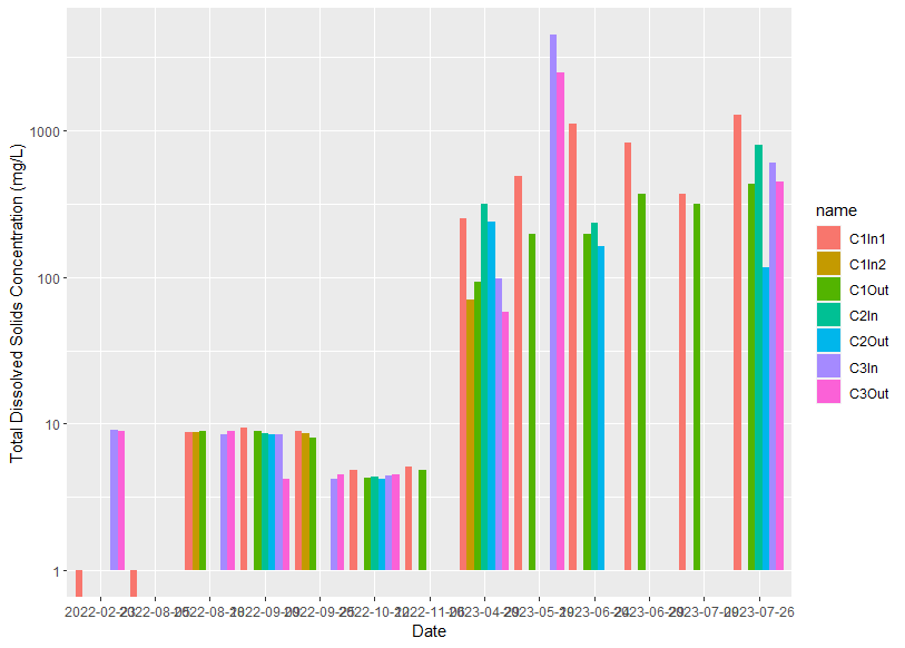
I have created the following plot in ggplot2
Using the following code.
mydata = structure(list(Date = c("2022-08-05", "2022-08-18", "2022-02-23",
                                 "2022-09-09", "2022-09-25", "2022-10-12", "2022-11-06", "2023-04-29",
                                 "2023-05-19", "2023-06-24", "2023-06-29", "2023-07-09", "2023-07-26"),
                        C1In1 = c(0, 8.794, 0, 9.38, 8.86, 4.866, 5.124, 250, 484.63,
                                  1107.53, 821.92, 367.5, 1265.6),
                        C1In2 = c(NA, 8.794, NA, NA, 8.66, NA, NA, 70.59,
                                  NA, NA, NA, NA, NA),
                        C1Out = c(NA, 8.898, NA, 8.9, 7.98, 4.28, 4.88,
                                  91.95, 197.91, 196.26, 367.92, 317.3, 433.3),
                        C2In = c(NA, NA, NA, 8.64, NA, 4.38, NA, 313.87, NA,
                                 233.01, NA, NA, 788.6),
                        C2Out = c(NA, NA, NA, 8.5, NA, 4.21, NA, 237.7, NA,
                                  162.16, NA, NA, 117.2),
                        C3In = c(NA, 8.52, 9.1, 8.5, 4.21, 4.46, NA, 98.16,
                                 4494.04, NA, NA, NA, 606.6),
                        C3Out = c(NA, 8.96, 8.85, 4.23, 4.48, 4.54, NA,
                                  57.43, 2487.91, NA, NA, NA, 447.6)),
                   row.names = c(NA, 13L),
                   class = "data.frame")

df = mydata |>
  pivot_longer(cols = -'Date')

ggplot() + scale_y_continuous(trans = "log10") + xlab("Date") + ylab("Total Dissolved Solids Concentration (mg/L)") +
  geom_bar(data = df, aes(x = Date, y = value, fill = name),
           stat = 'identity',
           position = 'dodge')
I want to clean up the plot by:
- reducing the number of dates shown along the x-axis
- changing the colours of the bars so that C1In1 is blue, C1In2 is midnightblue, C1Out is lightblue, C2In is red, C2 out is pink, C3In is darkgreen, and C3Out is lightgreen
- fixing the y-axis so that negative values are not shown in the plot
- removing the gridlines behind the plot.
Does anyone have any advice?
