Changing Hover Over in TS Function

Hello! I'm creating plots using the ts function in R and am running into problems when I try and use plotly. What I'm trying to do is change the hover over options so that when I run it in my app, it at least makes sense on what the viewer is looking at. At the moment, when I hover over a dot it shows" X:2022.000, Y:1857.

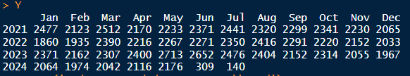
I fully understand that it is only looking at what the dataset is but how would I change it so that it shows Year: 2022, Count:1857. Below is the dataset using the ts function.

  Jan  Feb  Mar  Apr  May  Jun  Jul  Aug  Sep  Oct  Nov  Dec

2021 2477 2123 2512 2170 2233 2371 2441 2320 2299 2341 2230 2065
2022 1860 1935 2390 2216 2267 2271 2350 2416 2291 2220 2152 2033
2023 2371 2162 2307 2400 2713 2652 2476 2404 2152 2314 2055 1967
2024 2064 1974 2042 2116 2176 309 140

    # Time Plot
    # Shows basic line graph
    L <- autoplot(Y) + # quick function for plotting line graph
      ggtitle("Counts by Months") + # main title
      #ylab("Count") + # y coordinate title
      #xlab("Months in a Year") + # x coordinate title
      geom_line(size = 1, color = "#ffffff") + 
      geom_point(color = "#ffffff") + 
      geom_smooth() +
      scale_y_continuous(limits = c(0, NA), expand = c(0,0)) +
      theme_minimal() +
      theme(panel.border = element_rect(color = "#ffffff",
                                        fill = NA,
                                        size = 1)) +
      theme(axis.title.x = element_blank(),
            axis.title.y = element_blank())

image

If I understand you correctly, you're doing something like this:

library(ggplot2)
library(forecast)
library(plotly)
Y <- ts(matrix(sample(1000:9999, 48, replace = TRUE), 48,1), start = c(2021, 1), frequency = 12)
L <- autoplot(Y) +
  ggtitle("Counts by Months") + 
  geom_line(size = 1, color = "#ffffff") +
  geom_point(color = "#ffffff") +
  geom_smooth() +
  scale_y_continuous(limits = c(0, NA), expand = c(0, 0)) +
  theme_minimal() +
  theme(panel.border = element_rect(
    color = "#ffffff",
    fill = NA,
    size = 1
  )) +
  theme(axis.title.x = element_blank(), axis.title.y = element_blank())
ggplotly(L)

Did I get that right? I just want to make sure that we have an MRE ( minimal reproducible example).

Yes! I just want to try and change the hover options so that it reads something else and not x and y.

You could rewrite forcast:::autoplot.ts so that it generates data that has the labels you want:

library(ggplot2)
library(forecast)
library(plotly)


Y <- ts(matrix(sample(1000:9999, 48, replace = TRUE), 48,1), start = c(2021, 1), frequency = 12)

autoplot.ts <- function (object, series = NULL, xlab = "Time", ylab = deparse(substitute(object)), 
          main = NULL, ...) 
{
  if (!requireNamespace("ggplot2", quietly = TRUE)) {
    stop("ggplot2 is needed for this function to work. Install it via install.packages(\"ggplot2\")", 
         call. = FALSE)
  }
  else {
    if (!is.ts(object)) {
      stop("autoplot.ts requires a ts object, use object=object")
    }
    # object <- Y
    data <- data.frame(Value = as.numeric(object), Time = as.numeric(time(object)))
    if (!is.null(series)) {
      data <- transform(data, series = series)
    }
    p <- ggplot2::ggplot(ggplot2::aes(y = .data[["Value"]], x = .data[["Time"]]), 
                         data = data)
    if (!is.null(series)) {
      p <- p + ggplot2::geom_line(ggplot2::aes(group = .data[["series"]], 
                                               colour = .data[["series"]]), na.rm = TRUE, ...)
    }
    else {
      p <- p + ggplot2::geom_line(na.rm = TRUE, ...)
    }
    p <- p + forecast:::ggAddExtras(xlab = xlab, ylab = ylab, main = main)
    p <- p + ggplot2::scale_x_continuous(breaks =  forecast:::ggtsbreaks)
    return(p)
  }
}

L <- autoplot(Y) +
  ggtitle("Counts by Months") + 
  geom_line(size = 1, color = "#ffffff") +
  geom_point(color = "#ffffff") +
  geom_smooth() +
  scale_y_continuous(limits = c(0, NA), expand = c(0, 0)) +
  theme_minimal() +
  theme(panel.border = element_rect(
    color = "#ffffff",
    fill = NA,
    size = 1
  )) +
  theme(axis.title.x = element_blank(), axis.title.y = element_blank())

ggplotly(L)

That worked! Thanks!

This topic was automatically closed 7 days after the last reply. New replies are no longer allowed.

If you have a query related to it or one of the replies, start a new topic and refer back with a link.