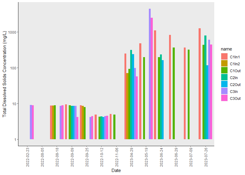
I have created the following plot in ggplot2 (see code below). I am trying to 1) change the font of the text to Times New Roman, 2) change the color of the background from grey to white, and 3) change the title "name" in the legend to "site". Does anyone have any suggestions?
library(lubridate)
library(ggplot2)
mydata = structure(list(Date = c("2022-08-05", "2022-08-18", "2022-02-23",
                                 "2022-09-09", "2022-09-25", "2022-10-12", "2022-11-06", "2023-04-29",
                                 "2023-05-19", "2023-06-24", "2023-06-29", "2023-07-09", "2023-07-26"),
                        C1In1 = c(NA, 8.794, NA, 9.38, 8.86, 4.866, 5.124, 250, 484.63,
                                  1107.53, 821.92, 367.5, 1265.6),
                        C1In2 = c(NA, 8.794, NA, NA, 8.66, NA, NA, 70.59,
                                  NA, NA, NA, NA, NA),
                        C1Out = c(NA, 8.898, NA, 8.9, 7.98, 4.28, 4.88,
                                  91.95, 197.91, 196.26, 367.92, 317.3, 433.3),
                        C2In = c(NA, NA, NA, 8.64, NA, 4.38, NA, 313.87, NA,
                                 233.01, NA, NA, 788.6),
                        C2Out = c(NA, NA, NA, 8.5, NA, 4.21, NA, 237.7, NA,
                                  162.16, NA, NA, 117.2),
                        C3In = c(NA, 8.52, 9.1, 8.5, 4.21, 4.46, NA, 98.16,
                                 4494.04, NA, NA, NA, 606.6),
                        C3Out = c(NA, 8.96, 8.85, 4.23, 4.48, 4.54, NA,
                                  57.43, 2487.91, NA, NA, NA, 447.6)),
                   row.names = c(NA, 13L),
                   class = "data.frame")

df = mydata |>
  pivot_longer(cols = -'Date')

p <- ggplot() + scale_y_continuous(trans = "log10") + xlab("Date") + ylab("Total Dissolved Solids Concentration (mg/L)") +
  geom_bar(data = df, aes(x = Date, y = value, fill = name),
           stat = 'identity',
           position = 'dodge') +
  theme(axis.line = element_line(color='black'),
        plot.background = element_blank(),
        panel.grid.major = element_blank(),
        panel.grid.minor = element_blank(),
        panel.border = element_blank(),   # removes grid lines from plot
  ) + theme(axis.text.x = element_text(angle = 90, vjust = 0.5),
            panel.grid = element_blank()
    + scale_x_discrete(labels = c('Aug 5/22', 'Aug 18/22', 'Aug 23/22', 'Sep 9/22', 'Sep 25/22', 'Sep 25/22', 'Oct 12/22', 'Nov 2/22', 'Apr 29/23', 'May 19/23', 'Jun 24/23', 'Jun 29/23', 'Jul 9/23', 'Jul 26/23')))
p # display the plot ```