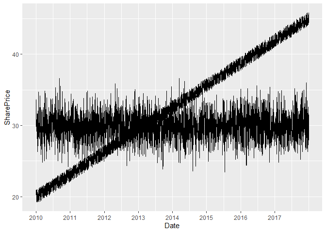
I'm plotting 2 lines on the same graph and I'm having difficulty chagning the X axis labels. I think this is becuase of the way my data is formatted but I'm not sure. My data is an excel file converted to csv format. I just want to have the years 2010 through to 2017 along the X axis rather than 0, 25, 50, 75, 100. I've commented out where I was using scale_x_discrete as it seems to just remove the x axis ticks.
My code:
mydf <- read.csv("EC4044 Data.csv") #Loads data into R studio
mydf$fuelpriceX25 <- mydf$fuelprice * 25
head(mydf)
ggplot(mydf, aes(x=1:96)) +
geom_line(aes(y = shareprice), color = "darkred") +
geom_line(aes(y = fuelpriceX25), color="steelblue") +
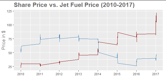
ggtitle("Share Price vs. Jet Fuel Price (2010-2017)") +
#scale_x_discrete(breaks = c("0", "12", "24", "36", "48", "60", "72", "84"),
#labels = c("2010", "2011", "2012", "2013", "2014", "2015", "2016", "2017")) +
labs(x="", y="Price in $") +
theme(axis.title.y = element_text(size=12, family="Trebuchet MS", color="#666666")) +
theme(plot.title = element_text(size=16, family="Trebuchet MS", face="bold", hjust=0, color="#666666")) +
theme(axis.text = element_text(size=8, family="Trebuchet MS"))
My Output
  ï..na count       date shareprice fuelprice fuelpriceX25
1     0     1 01/01/2010      25.23     2.129       53.225
2     0     2 01/02/2010      26.68     2.018       50.450
3     0     3 01/03/2010      26.39     2.144       53.600
4     0     4 01/04/2010      27.35     2.272       56.800
5     0     5 01/05/2010      22.86     2.199       54.975
6     0     6 01/06/2010      26.31     2.105       52.625
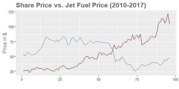
When I change "ggplot(mydf, aes(x=1:96)) +" to "ggplot(mydf, aes(date)) +" I get an empty graph with lots of overlapping text where the x axis ticks should be