Sooo
June 7, 2020, 2:49pm
1
Hello,
HONGKONG$S = ifelse(HONGKONG$City == "HongKong", 0, 1)
HONGKONG$did = HONGKONG$P * HONGKONG$S

city1<-HONGKONG$City==as.character("HongKong")
city2<-HONGKONG$City==as.character("Singapur")

plot(HONGKONG$Datum[city1],HONGKONG$Passengers[city1],
     type="l",col="red",xlab="Zeitraum",
     xlim=as.Date(c("2017-01-31", "2019-12-31")),
     ylim=c(4500000,7000000), ylab="Anzahl Fluggäste")

lines(HONGKONG$Datum[city2],HONGKONG$Passengers[city2],col="blue")
I've tried different options based on a last post but it doesn't work.
Leon
June 7, 2020, 5:59pm
2
Hi @Sooo ,
It easier for us to help you out, if we have some data to use.
I hope the following is useful:
# Load libraries ----------------------------------------------------------
library("tidyverse")
library("lubridate")

# Create example data -----------------------------------------------------
set.seed(890948)
d <- tibble(date = dmy(
  str_c(sample(1:30, size = 100, replace = TRUE), "-",
        sample(1:12, size = 100, replace = TRUE), "-",
        sample(2017:2019, size = 100, replace = TRUE))),
  passengers = sample(4500000:7000000, size = 100, replace = TRUE)
)

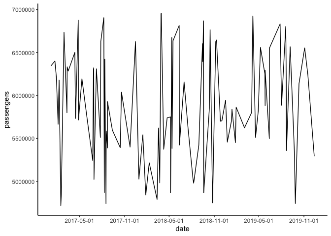
# Visualise ---------------------------------------------------------------
d %>%
  ggplot(aes(x = date, y = passengers)) +
  geom_line() +
  theme_classic()
Hope it helps
3 Likes
Building off Leon's reprex (thank you!), look at ggplot2's scale_y_continuous break options for the y-axis, and scale_x_date options for the x-axis.
For example,
library("tidyverse")
library("lubridate")

# Create example data -----------------------------------------------------
set.seed(890948)
d <- tibble(date = dmy(
  str_c(sample(1:30, size = 100, replace = TRUE), "-",
        sample(1:12, size = 100, replace = TRUE), "-",
        sample(2017:2019, size = 100, replace = TRUE))),
  passengers = sample(4500000:7000000, size = 100, replace = TRUE)
)

# Visualise ---------------------------------------------------------------
d %>%
  ggplot(aes(x = date, y = passengers)) +
  geom_line() +
  theme_classic() +
  scale_y_continuous(minor_breaks = seq(4500000, 7000000, 500000)) +
  scale_x_date(
    breaks = "6 month"
  )
Created on 2020-06-08 by the reprex package (v0.3.0)
3 Likes
Sooo
June 9, 2020, 5:03am
4
@Leon and @EconomiCurtis Thank you very much for the help
Leon
June 9, 2020, 6:38am
5
Sure thing @Sooo - Kindly remember to mark the solution
2 Likes
system
June 16, 2020, 6:38am
6
This topic was automatically closed 7 days after the last reply. New replies are no longer allowed.
