I would like to change my y axis in a normal "plot" not ggplot to a percent scale. So that I can fix i.e a year (of the x axis) as 100% and then it shows for the years bevor and after how much % they deviate, but the visual picture remains the same as without the new y axis. It this possible on a normal "plot"?
why should the visuals look different when you linearly scale everything in proportion ?
if you want to stretch/squash or shift the data you need to say how ...
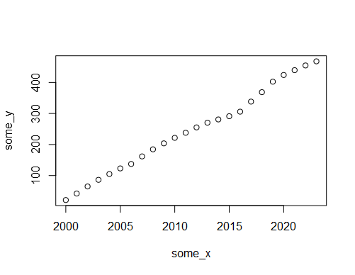
(some_x <- 2000:2023)
(some_y <- cumsum(mtcars$mpg[1:24]))
plot(x=some_x,
y=some_y)
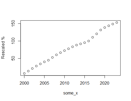
# value of y when x whas 2016
(adjustment <- some_y[some_x == 2016])
(rescaled_y <- 100*some_y / adjustment)
plot(x=some_x,
y=rescaled_y,ylab = "Rescaled %")
1 Like
Thank you very much, it was exactly what I was looking for. Great!!
Do you know by any chance if it's possible to change the side of the y axis to the right in a normal plot?
This topic was automatically closed 7 days after the last reply. New replies are no longer allowed.
If you have a query related to it or one of the replies, start a new topic and refer back with a link.