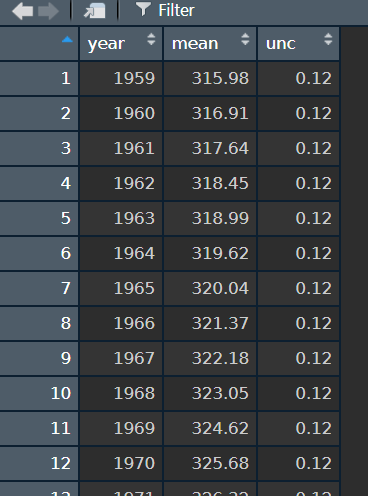
I have a NOAA dataset with 50+ entries of CO2 concentration against year. I want to point out the values for each decade i.e. those concentrations for 1980, 1990, 2000 etc. I think either a different colour and/or data labels would be good. I already tried to produce a scatterplot using ggplot2 and have an error (Error in +xlab("year") : invalid argument to unary operator), and I am especially stuck when it comes to labelling specific points or coloring specific points according to a rule (every 10 years).
Here is my code:
attach(NOAA)
library(ggplot2)
decade <- c(1960,1970,1980,1990,2000,2010,2020)
ggplot(NOAA) + geom_point(aes(x="year",y="mean",colour=decade))
I get this error message
Error: Aesthetics must be either length 1 or the same as the data (62): colour
I have no idea what the error message means in this case, though I have read about it in general.