Forget all this. I see I totally misread the question
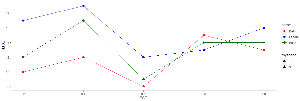
ggplot(df, aes(PSF)) +
  geom_line(aes(y = Delhi), colour = "red") +
  geom_point(aes(y = Delhi), colour = "red") +
  geom_line(aes(y = Paris), colour = "dark green") +
  geom_point(aes(y = Paris), colour = "dark green")  +
  geom_line(aes(y = Lahore), colour = "blue") +
  geom_point(aes(y = Lahore), colour = "blue",shape = 17, size = 3)  +
  theme(panel.background = element_blank()) +
  labs(y = "RMSE") +
  scale_x_continuous(breaks = seq(0, 3, 0.2)) +
  scale_y_continuous(breaks = seq(6, 30, 2)) +
  theme(axis.line = element_line(colour = "grey"))
You do not need to plot each line separately as long as you do not mind different symbols on each line. You just need to change the data layout from wide to long
dat2  <-  structure(list(PSF = c(0.2, 0.4, 0.6, 0.8, 1, 0.2, 0.4, 0.6,
0.8, 1, 0.2, 0.4, 0.6, 0.8, 1), City = structure(c(1L, 1L, 1L,
1L, 1L, 2L, 2L, 2L, 2L, 2L, 3L, 3L, 3L, 3L, 3L), levels = c("Delhi",
"Paris", "Lahore"), class = "factor"), RMSE = c(10L, 12L, 8L,
15L, 13L, 12L, 17L, 9L, 14L, 14L, 17L, 19L, 12L, 13L, 16L)), row.names = c(NA,
-15L), class = "data.frame")

ggplot(dat2, aes(PSF, RMSE, colour = City)) +
    geom_line() + geom_point(aes(shape = City, size = 2)) +
  guides( size = FALSE)
I did the change from wide to long (see code below) but you can do the same thing using the pivot_longer~ function in the ~tidyr package which is a part of the tidyverse parkage.
library(data.table)
dat2 <- melt(dat1, id.var = "PSF",  measure.variables = c("Delhi", "Paris", "London"),
             variable.name = "City", value.name = "RMSE")

```[quote="jrkrideau, post:3, topic:160070, full:true"]
ggplot(df, aes(PSF)) +
geom_line(aes(y = Delhi), colour = "red") +
geom_point(aes(y = Delhi), colour = "red") +
geom_line(aes(y = Paris), colour = "dark green") +
geom_point(aes(y = Paris), colour = "dark green") +
geom_line(aes(y = Lahore), colour = "blue") +
geom_point(aes(y = Lahore), colour = "blue",shape = 17, size = 3) +
theme(panel.background = element_blank()) +
labs(y = "RMSE") +
scale_x_continuous(breaks = seq(0, 3, 0.2)) +
scale_y_continuous(breaks = seq(6, 30, 2)) +
theme(axis.line = element_line(colour = "grey"))
You do not need to plot each line separately as long as you do not mind different symbols on each line. You just need to change the data layout from `wide` to `long`
dat2 <- structure(list(PSF = c(0.2, 0.4, 0.6, 0.8, 1, 0.2, 0.4, 0.6,
0.8, 1, 0.2, 0.4, 0.6, 0.8, 1), City = structure(c(1L, 1L, 1L,
1L, 1L, 2L, 2L, 2L, 2L, 2L, 3L, 3L, 3L, 3L, 3L), levels = c("Delhi",
"Paris", "Lahore"), class = "factor"), RMSE = c(10L, 12L, 8L,
15L, 13L, 12L, 17L, 9L, 14L, 14L, 17L, 19L, 12L, 13L, 16L)), row.names = c(NA,
-15L), class = "data.frame")
ggplot(dat2, aes(PSF, RMSE, colour = City)) +
geom_line() + geom_point(aes(shape = City, size = 2)) +
guides( size = FALSE)
I did the change from `wide` to `long` (see code below) but you can do the same thing using the `pivot_longer~ function in the ~tidyr` package which is a part of the `tidyverse` parkage.
library(data.table)
dat2 <- melt(dat1, id.var = "PSF", measure.variables = c("Delhi", "Paris", "London"),
variable.name = "City", value.name = "RMSE")
[/quote]
