Change range of y axis in boxplot with outlier

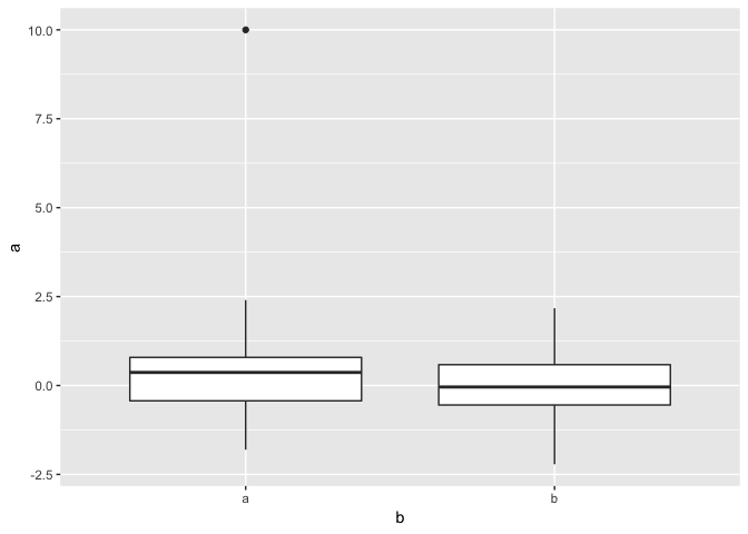
I have a boxplot with an extreme outlier. I'd prefer not to change the scale or remove the outlier, rather just change the range and add an indicator arrow or the likes with the value.

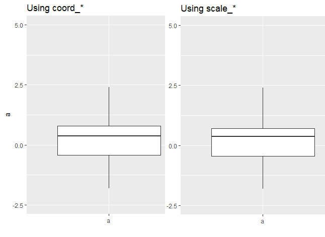
Is it possible to do something similar to answer 2 from this SO question in ggplot?

E.g. in the plot below the range of y would go to ~ 2.5 and an arrow with a value would indicate the presence of an outlier in a.

``` r
library(tidyverse)
set.seed(1)
Df <- tibble(a = rnorm(100),
             b = rep(c("a", "b"), 50))

Df$a[1] <- 10


Df %>% 
ggplot(aes(b, a)) +
  geom_boxplot()

Created on 2018-12-14 by the reprex package (v0.2.1)

How's this?

pp <- Df %>% 
   ggplot(aes(b, a)) +
   geom_boxplot()
pp + scale_y_continuous(limits = c(-2.5, 5)) +
     annotate("segment", x = 1, xend = 1, y = 4, yend = 5, arrow = arrow()) +
     annotate("text", x = 1, y = 3.75, label = "outlier at\n a = 10"

Ron.

As @ron shows, a scale_* function can work. But the coord_* functions do something similar. The differences are:

  • scale_* will remove any observations that don't fall within the limits. This could affect other calculations.
  • coord_* will just restrict the limits of what's drawn. Nothing from the dataset is ignored for calculations.

You can actually see this with your example:

ggplot(Df, aes(b, a)) +
  geom_boxplot() +
  coord_cartesian(ylim = c(-2.5, 5)) +
  labs(title = "Using coord_*")

ggplot(Df, aes(b, a)) +
  geom_boxplot() +
  scale_y_continuous(limits = c(-2.5, 5)) +
  labs(title = "Using scale_*")

compare-scale-coord

Edited to help comparison

The top of the boxes are somewhat different. It's not much, but it shows the point.

3 Likes

Thank you, this should do the trick! On a side note, where does arrow = arrow() "come from"? The ellipsis for annotate() says arguments are passed to layer(), but there's no mention of arrow in layer()? How does it work?

This topic was automatically closed 7 days after the last reply. New replies are no longer allowed.