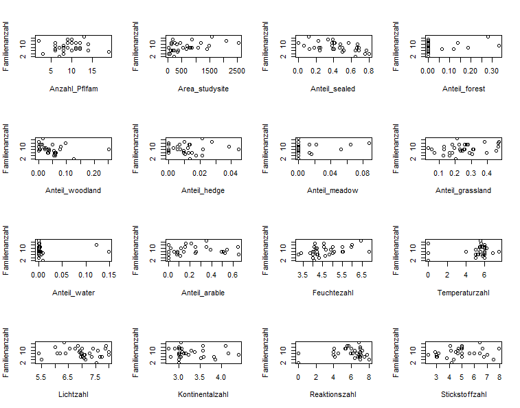
Hello,
I am very new to RStudio and was very happy to get the following graphic done. But now my supervisor of my master thesis tells me to show the Y-axis labels only at the beginning of each line and to make better use of the empty spaces between the plots by enlarging the plots. I would also like to change some X-axis labels. Can anyone help me how to adjust my code for this? Or should I work with a new code? I read something about a layout command, but I don't know how to use it.
Thank you very much.
par(mfrow = c(4,4))
plot(
Familienzahl_Coleoptera ~
Anzahl_Pflfam +
Area_studysite +
Anteil_sealed +
Anteil_forest +
Anteil_woodland +
Anteil_hedge +
Anteil_meadow +
Anteil_grassland +
Anteil_water +
Anteil_arable +
Feuchtezahl +
Temperaturzahl +
Lichtzahl +
Kontinentalzahl +
Reaktionszahl +
Stickstoffzahl,
data = envars,
ask = F,
ylab="Familienanzahl")
