There are no "mere" undergraduates when it comes to R! Every learner starts out and improves with experience. You're doing pretty well so far.
I should refer you to the homework guidelines, which is a convention on this site to give guidance on assigned problems, but not solutions, ready to hand in.
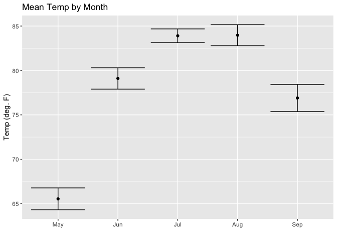
Here's a simpler ggplot recipe for error bars, such as what you already have:
# Adopted from Long & Teetor, R Cookbook, 2nd ed. § 10.11 https://rce2.com

library(dplyr)
#>
#> Attaching package: 'dplyr'
#> The following objects are masked from 'package:stats':
#>
#>     filter, lag
#> The following objects are masked from 'package:base':
#>
#>     intersect, setdiff, setequal, union
library(ggplot2)
library(forcats)
data(airquality)


aq_data <- airquality %>%
  arrange(Month) %>%
  mutate(month_abb = fct_inorder(month.abb[Month]))

ggplot(aq_data, aes(month_abb, Temp)) +
  geom_point(stat = "summary",
           fun.y = "mean",
           fill = "cornflowerblue") +
  stat_summary(fun.data = mean_se, geom = "errorbar") +
  labs(title = "Mean Temp by Month",
       x = "",
       y = "Temp (deg. F)")

ggplot(aq_data, aes(month_abb, Temp)) +
  geom_point(stat = "summary",
           fun.y = "mean",
           fill = "cornflowerblue") +
  stat_summary(fun.data = mean_se, geom = "errorbar") +
  labs(title = "Mean Temp by Month",
       x = "",
       y = "Temp (deg. F)")

Created on 2019-11-01 by the reprex package (v0.3.0)
Nearby, they also discuss plotting confidence intervals. Now, I can't tell from your plot whether it is observed values, in which case, how are you deriving confidence levels? (Wouldn't they necessarily lie inside the errorbars?) Or, is it a model, such as
fit <- lm(mean(dose) ~ dose, data = my_data)