Quite new to R Studio. Is it possible to use cdata package to summarise 95% confidence intervals to then plot these as error bars? Or do I have to use summarySE?
Or basically, how is it recommended to create a summary including 95% ci to then plot this on a geom_line/ geom_point? I used cdata to do this with SEM error bars but unsure how it translates to ci.
Hi, and welcome!
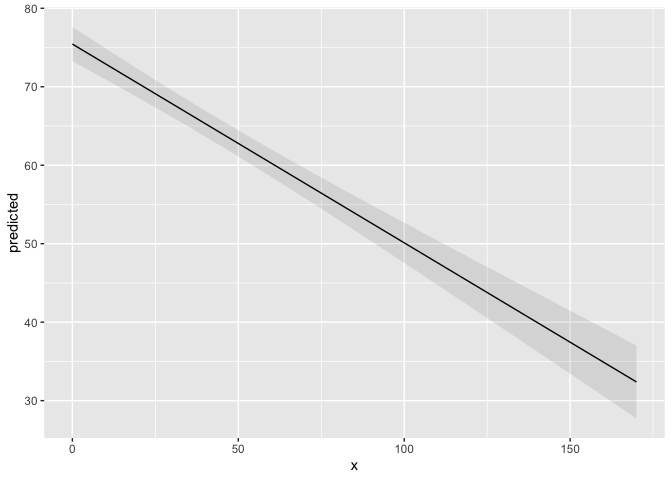
See @aosmith's answer. Here's a reproducible example, called a reprex of this code
library(ggplot2)
library(ggeffects)
data(efc)
fit <- lm(barthtot ~ c12hour + neg_c_7 + c161sex + c172code, data = efc)
mydf <- ggpredict(fit, terms = "c12hour")
ggplot(mydf, aes(x, predicted)) +
  geom_line() +
  geom_ribbon(aes(ymin = conf.low, ymax = conf.high), alpha = .1)

Created on 2019-10-31 by the reprex package (v0.3.0)
Although he used ggpredict to get the confidence limits, they are also available with
confint(fit)
              2.5 %   97.5 %
(Intercept) 89.5005 109.2778
c12hour     -0.2874  -0.2192
neg_c_7     -2.7392  -1.8553
c161sex     -2.8541   4.9369
c172code    -1.9238   3.3605
For adding geom_point(), what are you looking to plot on the x-axis?
Thank you for your help technocrat!
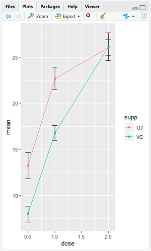
I am using some example data to produce a graph where x=dose and y=mean toothgrowth
So far I have been able to add error bars showing SEM using this:
ggplot(cdata, aes(x=dose, y=mean, colour=supp)) + geom_errorbar(aes(ymin=mean-se, ymax=mean+se), colour = "black", width=.1) + geom_line() + geom_point()
Before this I created a summary table for N, mean, sd, se, min and max but I didn't know if there was a way to include confidence intervals in the summary so I could then plot these as error bars? To create the summary I used this within the plyr package:
cdata <- ddply(ToothGrowth, c("supp","dose"), summarise, N = length(len), mean = mean(len), sd = sd(len), se = sd/sqrt(N), min = min(len), max = max(len))
So, I think I am ok with adding the geom_point () (unless you disagree - I am merely an undergraduate student struggling with this, hence how bad my explanations of my problem are)... my problem is adding the 95% ci bars.
Thank you so so much for your help!
There are no "mere" undergraduates when it comes to R! Every learner starts out and improves with experience. You're doing pretty well so far.
I should refer you to the homework guidelines, which is a convention on this site to give guidance on assigned problems, but not solutions, ready to hand in.
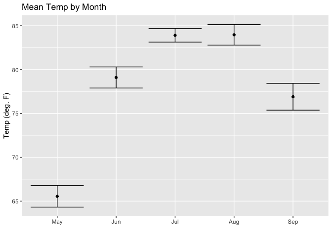
Here's a simpler ggplot recipe for error bars, such as what you already have:
# Adopted from Long & Teetor, R Cookbook, 2nd ed. § 10.11 https://rce2.com

library(dplyr)
#>
#> Attaching package: 'dplyr'
#> The following objects are masked from 'package:stats':
#>
#>     filter, lag
#> The following objects are masked from 'package:base':
#>
#>     intersect, setdiff, setequal, union
library(ggplot2)
library(forcats)
data(airquality)


aq_data <- airquality %>%
  arrange(Month) %>%
  mutate(month_abb = fct_inorder(month.abb[Month]))

ggplot(aq_data, aes(month_abb, Temp)) +
  geom_point(stat = "summary",
           fun.y = "mean",
           fill = "cornflowerblue") +
  stat_summary(fun.data = mean_se, geom = "errorbar") +
  labs(title = "Mean Temp by Month",
       x = "",
       y = "Temp (deg. F)")

ggplot(aq_data, aes(month_abb, Temp)) +
  geom_point(stat = "summary",
           fun.y = "mean",
           fill = "cornflowerblue") +
  stat_summary(fun.data = mean_se, geom = "errorbar") +
  labs(title = "Mean Temp by Month",
       x = "",
       y = "Temp (deg. F)")

Created on 2019-11-01 by the reprex package (v0.3.0)
Nearby, they also discuss plotting confidence intervals. Now, I can't tell from your plot whether it is observed values, in which case, how are you deriving confidence levels? (Wouldn't they necessarily lie inside the errorbars?) Or, is it a model, such as
fit <- lm(mean(dose) ~ dose, data = my_data)
This topic was automatically closed 21 days after the last reply. New replies are no longer allowed.
