Hi, and welcome!
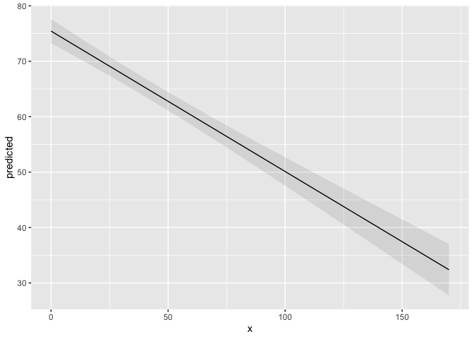
See @aosmith's answer. Here's a reproducible example, called a reprex of this code
library(ggplot2)
library(ggeffects)
data(efc)
fit <- lm(barthtot ~ c12hour + neg_c_7 + c161sex + c172code, data = efc)
mydf <- ggpredict(fit, terms = "c12hour")
ggplot(mydf, aes(x, predicted)) +
  geom_line() +
  geom_ribbon(aes(ymin = conf.low, ymax = conf.high), alpha = .1)

Created on 2019-10-31 by the reprex package (v0.3.0)
Although he used ggpredict to get the confidence limits, they are also available with
confint(fit)
              2.5 %   97.5 %
(Intercept) 89.5005 109.2778
c12hour     -0.2874  -0.2192
neg_c_7     -2.7392  -1.8553
c161sex     -2.8541   4.9369
c172code    -1.9238   3.3605
For adding geom_point(), what are you looking to plot on the x-axis?