Causality and Regression
Authors: Ben Rottman
Abstract: This Shiny app is designed to help students understand the relationships between causal relationships, scatterplots representing 3 variables, and multiple regression. Specifically, it is designed to help students understand why it is critical to control for confounds, helpful to control for ‘noise’ variables, and harmful to control for certain types of variables (sometimes called ‘overcontrol bias’). Users first choose a causal diagram (confound, noise, etc.), the number of observations, and the strengths of the causal relations, and the app generates simulated data. Then users see a scatterplot of the data, and can select different regressions to run. In the end, they can see which regressions uncover the true parameters and which reveal biased regression coefficients.
Full Description: This Shiny app was developed as part of my Open Source Research Methods for the Social Sciences (osRMss) course for undergrads in psychology and other behavioral and social sciences. It is also useful for grad students and students in other disciplines. This research methods course heavily focuses on causal inference.
The overall objectives of the app and the assignments are to help students understand that a researcher must use their knowledge of the study design and prior beliefs about the possible or plausible causal structures to decide on which variables to control for. All of this knowledge then helps a researcher determine the remaining plausible causal structures after doing the data analysis.
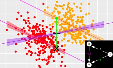
Users first choose a causal diagram (confound, noise, etc.), the number of observations, and the strengths of the causal relations. Then the app generates simulated data. Then, the user can decide how certain features about the how to graph the data in a scatterplot, and can choose between many different regressions. The regressions show all three bivariate relations, as well as multivariate relations controlling for the third variable.
Running different regressions also changes the graph to show what each regression means visually. For example, when running a simple bivariate relation only the single line of best fit is shown. When running a regression controlling for the third variable, two lines of best fit are shown, one for the two groups of the third variable. If an interaction is not added, then these two lines of best fit are parallel. If an interaction is added, then the slopes of the two groups can differ.
Additionally, the colors of the parameters in the graph, regression coefficients, and causal diagram are all connected in meaningful ways to help students understand what they mean and help them understand the connections between the three representations . For example, blue refers to an interaction. It appears as an arc in the causal diagram, also an arc showing the difference between the two slopes in the plot, and the interaction coefficient in the regression results. Green represents the main effect of the third variable. This shows up as the strength of the line from the third variable to the dependent variable in the causal diagram, as a line representing the difference in intercepts in the plot, and in the parameter for the third variable in the regression result.
These ideas are explored in 6 situations:
- Noise variables should be controlled for because doing so increases
power. However, controlling for noise variables does not
substantially change the regression weight. - Confounds must be controlled for. If a confound is not controlled for the entirelywrong regression weight (and p-value) will be found.
- Mediators can becontrolled for to detect if there is a direct relation between the independent and the dependent variable above and beyond the mediator, or if the only causal path is through the mediator.
- For interactions, if you think that there is likely to be an interaction, you need to specifically test for it - the computer won't test for an interaction on its own. If there is an interaction, the main effects may not be very meaningful on their own. But you shouldn't always test for interactions by default because testing for many interactions will get very complicated and also reduce your power for tests that you care more about.
- Alternative effects should not be controlled for because doing so will lower power.
- Common effects (‘colliders’) should not be controlled for because doing so will totally distort the true relation between IV1 and the DV.
What Students Should Be Able To Do After This Activity:
- Understand the relations between causal structures, scatterplots, and regression outputs. Specifically, to understand how much of the same information can be seen in each of the representations.
- Identify the specific reason for controlling for a third variable or not, which depends on the causal structure
Prerequisite Knowledge:
- How to read a causal diagram
- The basics of interpreting regression results
- Understand what controlling for a third variable means
Details about the activities connected to the app are available here. This page includes videos, slides, activities for students to engage with the app, and answer keys. The activities are available as word documents. Additionally, they are available as TopHat activities and H5P activities that provide students with immediate feedback. The entire course is available here.
Shiny app: Causality and Multiple Regression
Repo: GitHub - BenRottman/causality_and_regression: R shiny tutorial for learning how to understand the relationships between causality and multiple regression.
Thumbnail:
Full image: